


Flow, the shortened, active form of ‘workflow’, is the ability of users to get stuff done with your application.
Flow is something I’ve been fascinated with for a long time. While I was at Etsy, I made NFC cards for craft fair Etsy vendors so shoppers could collect favorite shops with a tap. I put in deep links to items, people, and shops so users could get directly to their desired destination.
We made sure that links to items that were pasted into convos took you to the page in the app, instead of opening a web page. My co-worker and I put together a prototype to allow sellers to answer, quote, and close custom order requests with a few taps on their mobile phones.*
All of these projects aimed to make it easier for people to do things.
Now at Daily, I’m in interested in how we can make video conferencing have more ‘flow’. We don’t want to make ‘video conference’ -ing easier. We want to make talking to people seamless.
But what makes a process, like setting up a video call, seamless? In order to answer this question, I’ve distilled 4 common features that I find that ‘seamless’ systems have in common:
- contextuality,
- location (geographical),
- connectivity, and
- directness.
* In case you’re wondering why you’ve never heard or seen of some of these features, only the deep links and convo to item links ever got shipped. If you’ve never noticed either of these, hopefully it’s because they made your workflow just ‘flow’.
Contextuality
Contextuality encompasses the questions: Where does the action need to occur? What’s the dominant ‘interaction’ mode that I’ll be in when I need to do some action?
Consider the case of the now almost ubiquitous ‘click to copy’ buttons. Click to copy buttons seem redundant, since there’s already a way to copy information on a computer: keyboard shortcuts or highlight and right-click. But I love click to copy buttons, I use them all the time.
Why? What about having a button to copy works so well?
Or a better way of phrasing it: What does click to copy save you the trouble of needing to do?
Let’s say you’re copying a link from a website on a hardtop computer with a physical mouse. Without a click-to-copy button, you would highlight the target text (which requires a skill: dexterity) then click the right mouse button to bring up an options menu, then the left button to affirm the copy action.
That’s assuming you use the mouse. If you’re a keyboard copyist, you’ll have to move your hand from the mouse to the keyboard, hit Ctrl+C to copy, then move your hand back to mouse to navigate to the appropriate location for pasting.
If you’re on a laptop and using a trackpad, ‘right’ clicking is hard because it takes two fingers and the right amount of force. Dragging to highlight on a trackpad takes an order of magnitude more dexterity and concentration than it does with a stand alone mouse.
Everything I said above for trackpads goes doubly on mobile. The only difference is that your fingers and your eyes need to go in the same place, which is at times largely impossible.
With a click-to-copy button, you just click, or tap, on a button. That’s a reduction of roughly 3 steps to 1.
There’s more to it than just a pure step reduction, though. By providing copy functionality via an on-screen button, a user stays in the same ‘manual context’. If you’re browsing the Internet with your mouse, you are probably just using the point, click and scroll actions — no right clicks, no drags. Providing a single click button lets a user browsing stay in their current ‘tactile interaction’ mode — it takes understanding of a user’s ‘context’ to provide this kind of convenience.
Another great example of a feature that maintains a user’s context is Slack’s ‘colon to emoji’ functionality. In a Slack chat, when you want to add an emoji to a message, you just type “:”, and it brings up a searchable list that you navigate using your keyboard. You can leave your fingers on the keyboard and get to the emoji you wanted.
Hangouts hasn’t figured this out yet — in order to add an emoji you have to click on a button and then search or scroll to find the icon that best expresses what you’re trying to say. In this case, clicking a button is forcing the user to change contexts — from keyboard to mouse.
Finally, context is a huge killer for online cart flows. Any time you’re shopping with a new vendor, you have to stop, get out your wallet, find your credit card, and then resume whatever it was that you were doing. Amazon recently briefly made Jeff Bezos the richest man in the world; they were the first to perfect the 1-click to buy button.
Coincidence?
When considering ‘flow’ it’s important to keep the ‘digital context’ — be it interaction mode or app embeddedness — of your user in mind. Any action that forces a user to switch a mode is less likely to happen.
Location
If context is ‘what room is the action taking place’ locality is the placement of the light switch in that room. Context would be getting all the necessary ingredients and tools in your kitchen to make cookies; location is making them easy to reach.
In software terms, location deals with problems like burying the buy button beneath the fold, or adding a much requested feature to the bottom of the settings page.
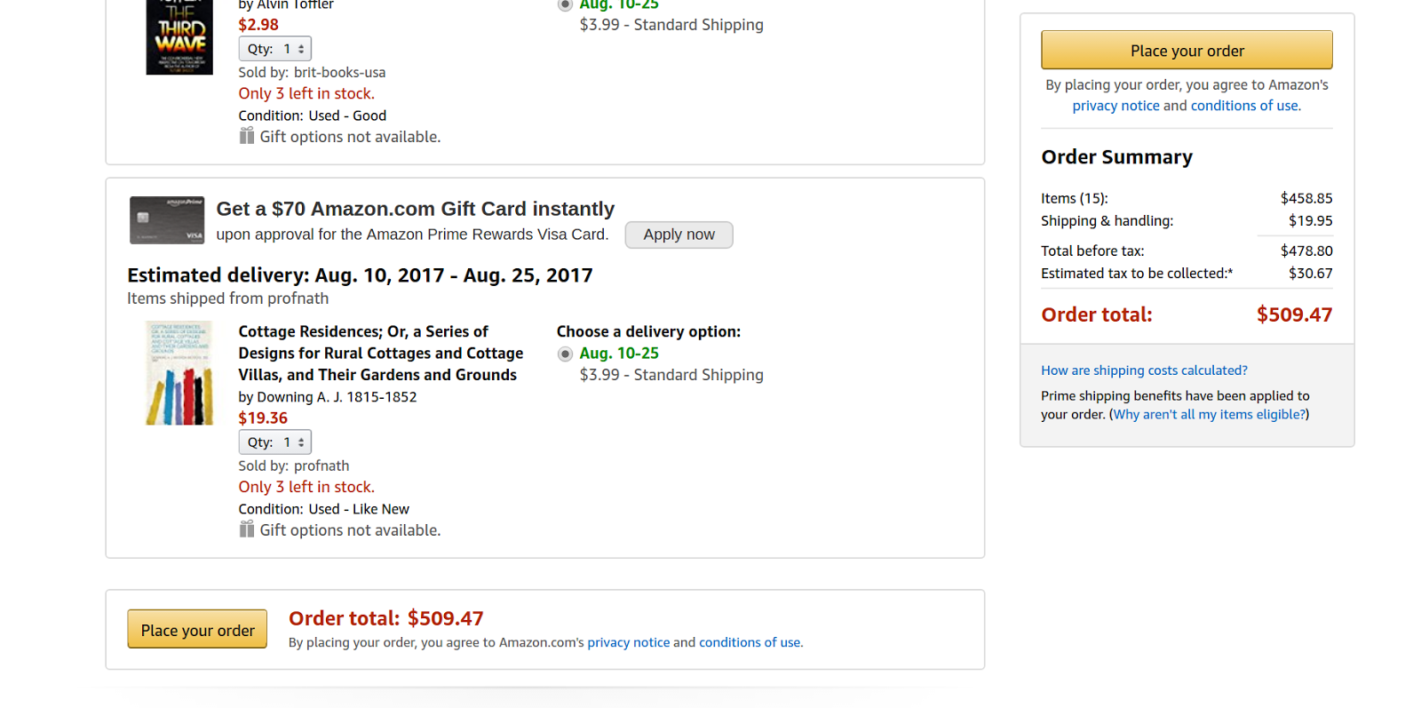
Amazon really nails location with the ‘Place Your Order’ button on their checkout page. A quick check on my desktop shows 2: one at the bottom of the list and another to the right of your items. It follows you down the page as your scroll — the ‘Place Your Order’ button is never off screen; it’s always literally within reach.
To bring location back to the example of click-to-copy buttons from the discussion on contextuality above, a well placed copy button would ideally place close to the text that you’re copying. If we’re considering mobile users, you might place the button near the bottom of the viewport, so that someone can tap the button using the same thumb that they use to scroll with, without shifting hands.
Whether they meant to or not, the Material design specs that Matias Duarte announced to much fanfare back in 2014 did a good job of respecting this idea of locality and button placement on mobile screens, at least with one of their new button designs.
Material Design heralded in the “Fabulous Action Button”, ‘Fab’ for short, which is typically placed it in the lower right hand corner, or halfway down the page at a ‘paper seam’.
In other words, in a place that’s easy for people reach. A few months later, Google released the Nexus 6P. With 5.96” of screen real estate, it is largest handset ever to wear the Nexus name. I’d be hard pressed to believe they didn’t know what was coming when they re-vamped the design specs earlier that year.
When considering user flow through a page, keep in mind what’s within reach for your users, when.
Connectivity
Connectivity is how well integrated your application is with the wider world. Entire startups have cropped up in an attempt to capitalize on ‘connectivity’: Zapier, IFTTT, and Button to name a few.
To revisit the ‘Click to Copy’ example; Copy is so useful to users because it is an integration. The copy action integrates your application into the global clipboard of a user’s computer — it allows them to get content from your application or webpage to another application on their computer.
The most obvious example of connectivity is the Share button on most mobile phone apps. Android has deeply embraced the “Share”, making it easy for you to push content between different apps on your phone; posting edited images to Instagram or sending favorite Tweets to friends with Messenger.
A quick look at the number of ‘platforms’ or ‘online services’ that offer “integrations” really drives home the value of providing connectivity.
You can roughly evaluate any chat application based on the number of integrations, or the amount of connectivity, that it provides — the more connections the more valuable.
The much bally-hooed introduction of Facebook chat bots was really a celebration of getting #brands to offer users a way to connect via Messenger. Slack recently announced changes to their apps, aiming to make Slack more well integrated with users’ workflows. Zulip, an open source chat platform I worked with last summer, devoted a good amount of time to building out a robust list of integrations.
Connectivity in software works much like connectivity in transportation systems. Back when the railroads were being built in the United States, real estate developers made a killing by buying up land that would soon be connected via rail, then reselling it at a premium after the rail had been developed.
Connectivity, whether for people or data, is high value. By providing the appropriate interfaces or integrations with which your system can interact with the greater ‘world’, you make it easier for people to get things done, or flow.
Directness
Directness can be measured by the number of distinct steps required in order to ‘complete’ a task. A few universal examples of tasks that can be easily measured for their directness are contacting support, finding a saved document, or sharing content on a mobile app.
One way I think about directness is in terms of the number of things a user will have to remember or perform. Humans may be able to remember seven digits in a phone number, but asking someone to remember seven steps in order to share a link or ask for help is too many.* This often comes to mind when I’m hunting for a link to contact customer service on a website that I’m having trouble with.
Directness is closely related to Connectivity. If your applications are ‘connected’ via integrations, then moving between them has the potential to be direct.
Don’t mistake it for directness, though. Nothing about a connection implies a reduction in the number of steps.
I spoke to an insurance agent on the telephone a few weeks back, following up with her about some documents that I had uploaded to their website. It took her a few moments to find them; the files that were uploaded were on a different part of their system from the rest of my application. I’m assuming that those systems were connected in some way, maybe just by the human that’s putting the pieces together.
While the connectivity of the system is debatable, the directness of it is not.
*As an aside, I’d love to see what Facebook’s AB test data has revealed about the number of steps humans are willing to take in order to ‘complete’ a digital action. Ever since hearing about their ‘how many crashes to make an Android user uninstall’ experiment, I’ve been curious about what other experiments they’ve run.
Speed
The speed with which a user can ‘flow’ through an action is not something that you, as a designer or developer, or experience engineer can actually change; speed is an output of a well designed flow. The way you unlock the ability to do something “speedily” is through the other attributes of flow: contextually, location, connectivity & seamlessness.
Any given user flow can be speedy, given a well-rehearsed user. Legacy users that are emotionally tied to the old, less ‘flow’-y User Interfaces are often quite fast at their jobs. That’s because they’ve internalized the multi-step, unintegrated flow. They may be fast, but they’re fast at a bad workflow.
Wrapping Up
For some more context: this thinking ties into work we've done at Daily. Making it easy and enjoyable for a user to get what they need to do, done is a huge part of what drives us.
Never miss a story
Get the latest direct to your inbox.