


A major goal of ours at Daily is to build video and audio APIs that work for as many people as possible. This means not only building high quality APIs, but also building UIs (user interfaces) that accommodate more than just an imaginary “average user”; we want Daily Prebuilt, our Dashboard, and our docs to be accessible to everyone.
One way we’ve worked towards this at Daily is to build our UIs following web accessibility standards from the start. Internally, we use a component library with components that have all been built to meet these basic standards, which means all of our UIs using this library have accessibility baked in. 🍞
In this tutorial, we’ll review web accessibility basics, and take a look at how we’ve implemented web accessibility in Daily’s own UIs. We know a site's accessibility can almost always be improved — and this is something we’re committed to working on continuously. However, if you’re building video apps for the first time (or even the second or third), we hope that some of the steps we’ve taken can inspire your own designs.
Web accessibility: What exactly is it?
Web accessibility refers to making website information and interactions available to everyone, regardless of barriers, such as disability, geography, language, device restrictions, and more. These barriers may be temporary, such as a broken arm, or permanent, such as a visual impairment.
Note: The term “accessibility” is sometimes written as “a11y”, which is a numeronym. (There are 11 letters between the first letter (“a”) and last letter (“y”). Hence, a11y. 😉)
Who benefits from web accessibility?
In terms of who web accessibility is for, it truly benefits everyone. We want to emphasize that because even people who don’t require accessible websites still benefit from them. 🙌
Accessible websites are often just better designed websites. Basic accessibility guidelines—like making sure your font size is large enough or your colour palette is high contrast enough—make the website easier for everyone to understand.
However, when accessibility is not considered, there are often specific groups of people who are affected most. This includes people with:
- Cognitive impairments (e.g. memory impairments)
- Neurological disorders (e.g. Parkinson’s)
- Physical, visual, auditory, or speech impairments (e.g. colour blindness, reduction in fine motor skills)
- Temporary impairments (e.g. broken arm)
- Poor network conditions (e.g. slow page load times)
- Small or old devices (e.g. reduced CPU capacity)
POUR Principles
The WCAG (Web Content Accessibility Guidelines) outline four principles for web accessibility, also known as the POUR principles. These principles are incredibly useful for testing whether a website meets the goals set out by web accessibility standards.
POUR is an acronym for perceivable, operable, understandable, and robust. These principles represent the following goals:
- Perceivable: Websites should be perceivable, i.e. available to the senses, such as vision, touch, and hearing.
- Operable: Users can interact with any elements on a webpage that are meant to be interacted with regardless of the device they’re using (e.g. mouse, keyboard, etc.)
- Understandable: Websites should be easy to understand regardless of how they’re read (e.g. visually, screen reader, etc.)
- Robust: Websites should maximize how compatible they are with various browsers, devices, operating systems, network conditions, etc.
Web Accessibility at Daily
Now that we’ve done a quick overview of what web accessibility is, let’s take a look at some of the ways Daily has made its UIs accessible. This is not a complete list of how we incorporate accessibility into Daily products, but we hope this helps give some inspiration with your own apps!
The list we’ll cover today includes:
- Making all UI elements keyboard-accessible, including how we use focus traps and avoid keyboard traps to enhance keyboard navigation
- Adding skip links in Daily’s Dashboard
- Special treatment of “hidden” elements
- Using semantic HTML
Making all interactive UI elements keyboard-accessible
One of the most effective ways to make websites more accessible is to make sure your audience can always interact with your site without a mouse. The idea is to make sure any element on the page that can be interacted with can be interacted with in multiple ways, whether it be a keyboard, mouse, or other device.
This means the site visitor should be able to tab through elements, submit forms or inputs, or escape optional views, like modals, without using a mouse.
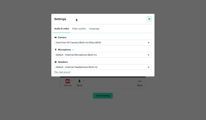
In the example below, notice how a participant can join a call and move through Daily Prebuilt’s video call UI only with a keyboard:
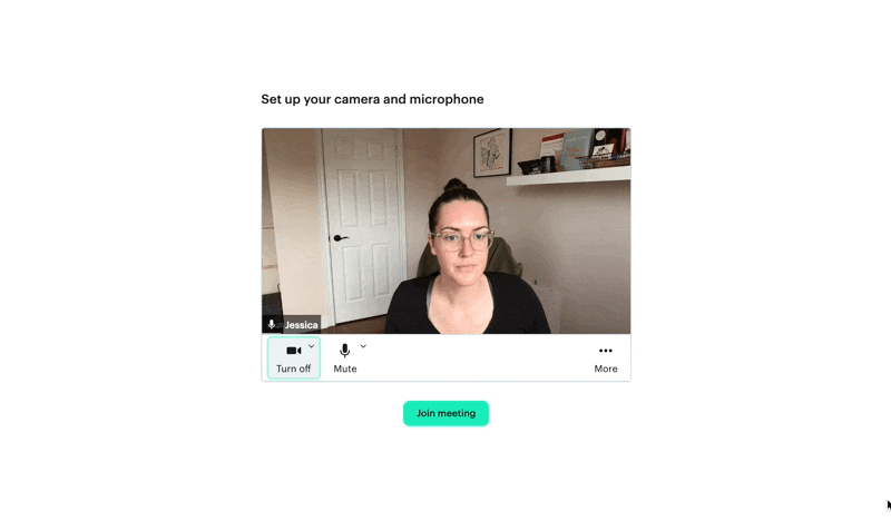
This is ideal because we never want site visitors to feel like they can’t join a call or, worse, can’t leave a call once they’ve joined. No one should ever feel “stuck” moving through the user flow.
If you’re curious what tabbing through a Daily call is like with a screen reader, watch this example below, which is using a screen reader Chrome extension.
Adding focus traps
Another way of helping non-mouse users is to include focus traps in your websites.
Focus traps refer to traps (or loops) of focusable elements within a parent element on the page. A common example of when to use this is with a modal. When a site visitor opens a modal, if they tab through the contents of the modal and get to the end, tabbing again should bring the user back to the first tabbable element in the modal. This is in contrast to another, less accessible option: continuing to tab to the next element in the DOM—past the modal— while the modal is still open.
The reason focus traps are useful is because we can assume while the modal is open, the modal is the only element the visitor is trying to interact with until they close it.
Avoiding keyboard traps
Wait, are “traps” bad or good? Well, it depends! We now know why focus traps are good for accessibility, but is there ever a time where trapping the focus is bad?
You can probably tell from the name of this section: yes!
A “keyboard trap” refers to when an element can be focused but can’t be unfocused. The site visitor gets trapped on an element if they’re only using a keyboard. Since some users can’t use a mouse, any action a site visitor takes with a keyboard should be able to be undone.
An example of this is if you open a modal to change your username in a Daily call.
In this first example below, we see a modal with a username form and one button to change the name. If I’m only using a keyboard, there’s no button to close the modal or cancel changing my name. If the keyboard’s Escape key doesn’t close the modal either, I’ll have to fill out the form to get back to the video call. This is what we don’t want.
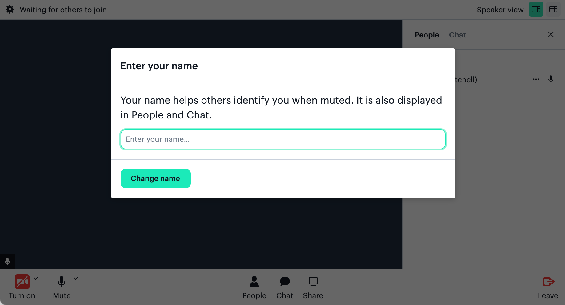
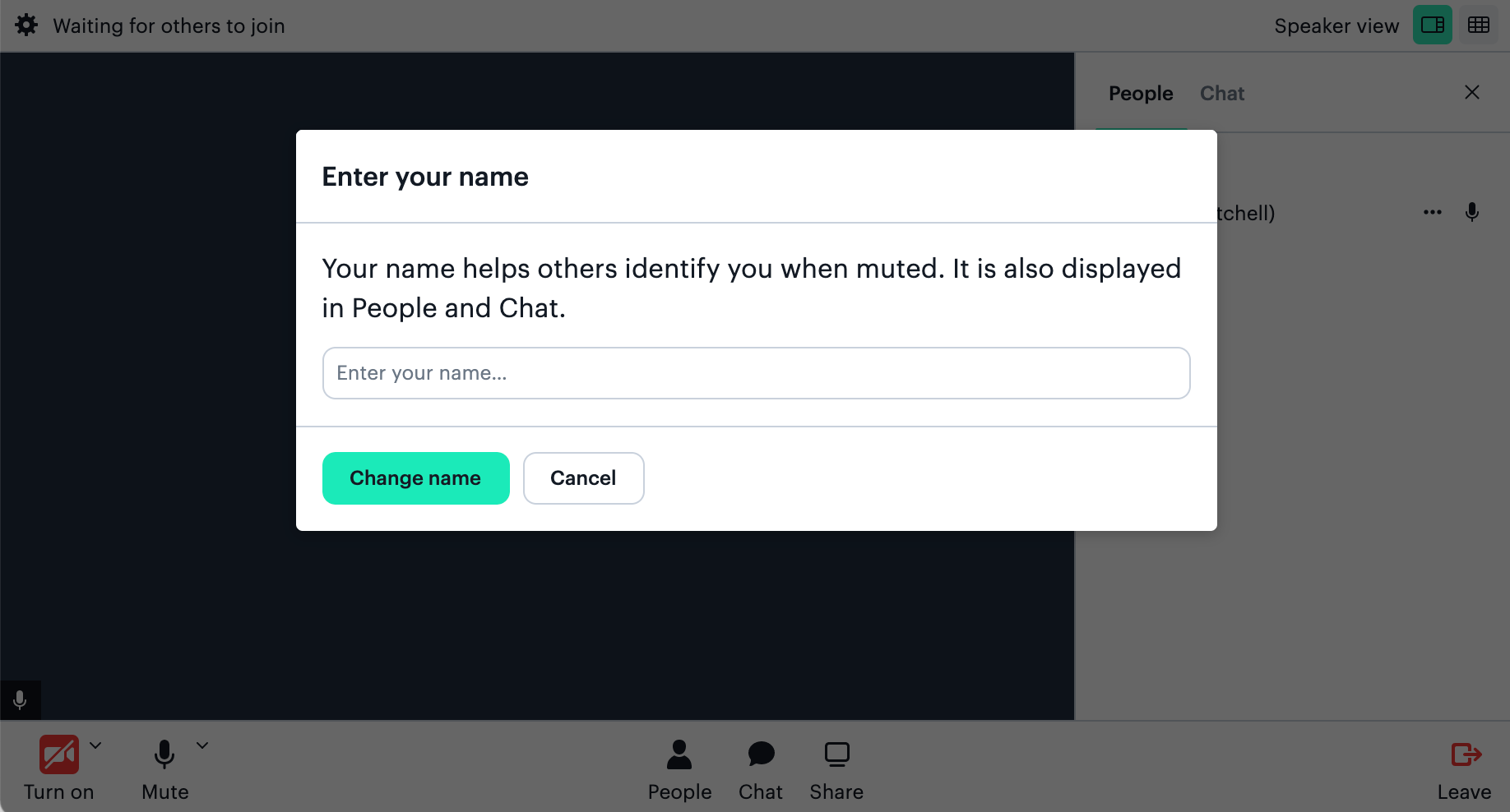
Now let’s compare that scenario to how Daily Prebuilt’s username form is actually set up: The modal can be closed with a keyboard’s Escape key or by pressing the Cancel button. The call participant is never forced to change their username if the username modal has been opened.
Adding skip links to Daily’s Dashboard
Another web accessibility feature that can help non-mouse users a lot is to add skip links to websites with navigation bars or a lot of links in the header. Skip links are links that are styled to be off screen unless they’re tabbed to, which means you don’t see them if you’re using a mouse.
You can include more than one skip link; ideally, you want to give site visitors the option of skipping to whichever section of the page they may want to jump to without having to tab through the entire page.
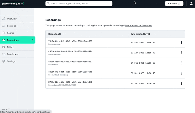
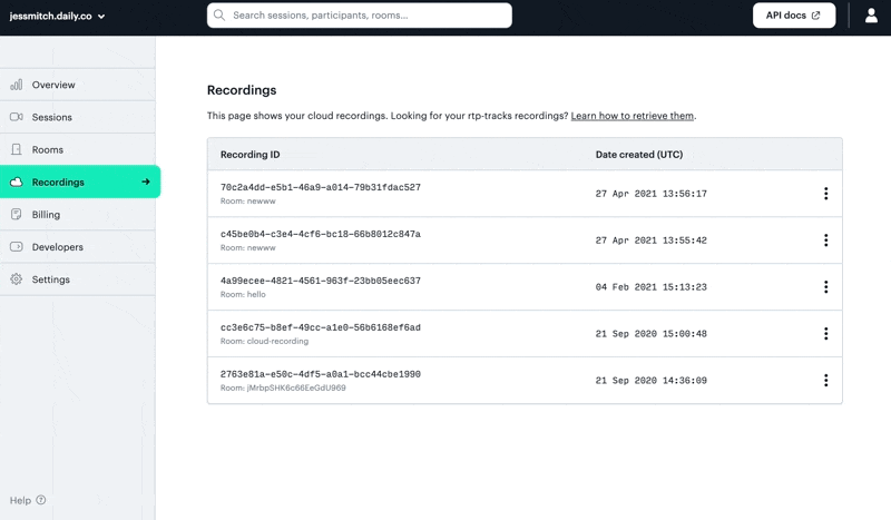
As an example of this, let’s look at Daily’s Dashboard. If you’re looking at the Recordings page and want to get to the Learn how to retrieve rtp-tracks recordings link, you have to tab through the header and nav bar to get to the main content.
To make this easier to navigate by keyboard, we can add two skip links:
Skip to navigationto avoid having to tab through the headerSkip to mainto avoid tabbing through the header and nav bar
Since we are already on the Recordings page in the example below, we can skip right to the main content with one tab and open that first link. 🎊
To create these skip links in the Daily Dashboard, we added two anchor tags to the top of our Dashboard header:
   <header>
     <a className="skip-link" href="#main">
       Skip to main content
     </a>

     <a className="skip-link" href="#nav">
       Skip to navigation
     </a>
     ...
Then, we style them to not show by default and instead only show when they are being focused on. We do this by clipping the links to be 1 x 1px, and updating the clip property only when they’re focused.
.skip-link {
    clip: rect(1px, 1px, 1px, 1px);
    height: 1px;
    overflow: hidden;
    position: absolute;
    white-space: nowrap;
    width: 1px;
}
.skip-link:focus {
    background-color: blue;
    color: white;
    clip: auto;
    height: auto;
    overflow: auto;
    padding: 2px;
    top: 0;
    width: auto;
    z-index: 999;
}
Lastly, we add an id attribute (#main and #nav) to the associated elements so clicking the link (the anchor tag) brings the focus to that part of the page. The end result is that all the content between the link and the target (i.e. the header and the nav bar) gets skipped in the tab order.
Special treatment of “hidden” elements
Along the same lines of skip links, there are other times when an element may be off screen. One example is when icons are used for buttons and we want screen readers to know how to interpret them, as well.
Creating hidden labels for screen readers
The way we handle this at Daily is by using a <VisuallyHidden> React component in the button contents, which is really just a <span> with text that is styled to not be visible. This means the screen reader can read it but site visitors who can visually see the UI will just see the icon.
It’s important to note when you are visually hiding an element meant for a screen reader, you should not use visible:hidden; or display:none;. Both of these CSS properties will hide the element visually and hide it from a screen reader, which is not what we want.
Instead, like in the previous skip link example, we want to style it to only not be visually shown. There are a few ways to do this, so let’s look at how we hide text in Daily’s component library:
export const VisuallyHidden: React.FC = ({ children }) => (
 <span>
   {children}
   <style jsx>{`
     span {
       clip: rect(1px, 1px, 1px, 1px);
       height: 1px;
       overflow: hidden;
       position: absolute;
       white-space: nowrap;
       width: 1px;
     }
   `}</style>
 </span>
);
Similar to the skip link, we clip the <span> to be 1 x 1px and hide any overflowing content. This successfully prevents the text from being seen while still letting the screen reader read it.
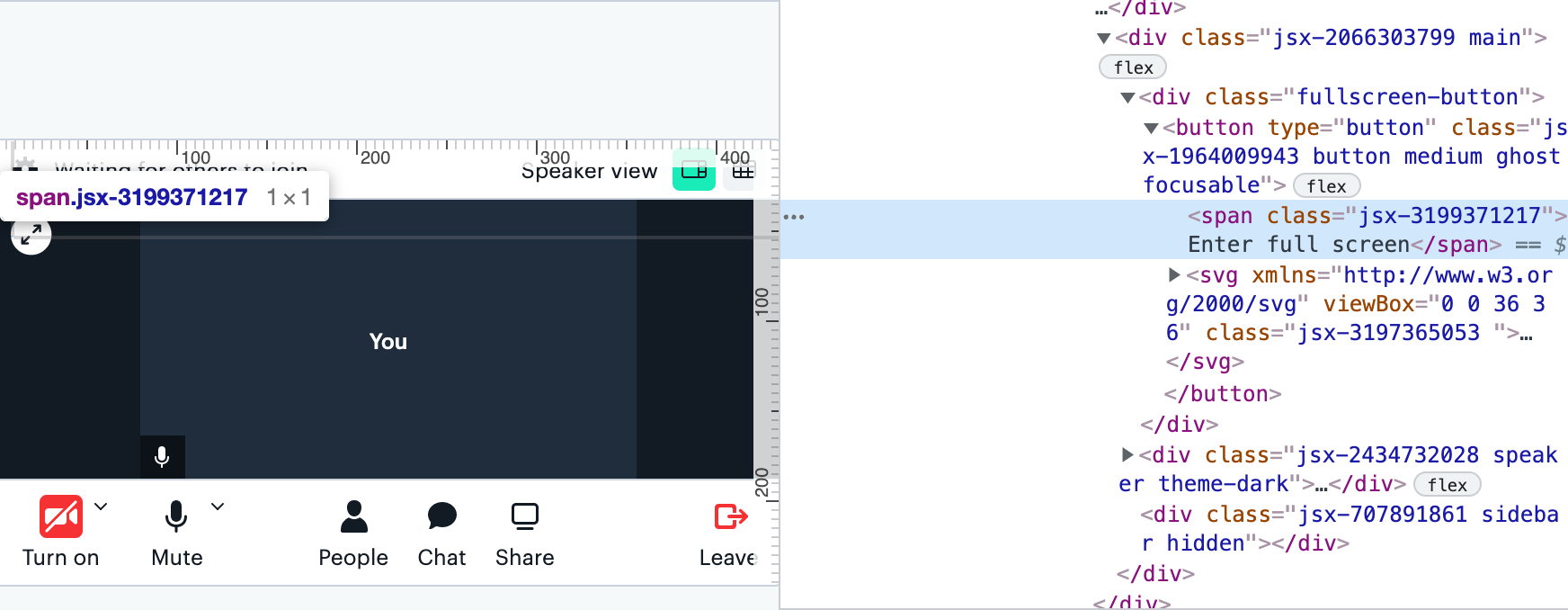
Our Daily Prebuilt full screen button is one example where this <VisuallyHidden> component is used. Since it is just a full screen icon in the Prebuilt UI, we add text to make it more descriptive for a screen reader.
To ensure it can be read properly by screen readers, a span with the text “Enter full screen” is included in the HTML but not shown in the UI.
Removing hidden elements from the tab order
Another example of special treatment of hidden elements is removing an element from the tab order if it is in the DOM but the site visitor is not meant to be aware of it.
For example, tooltips included in Daily Prebuilt are not shown unless hovered over. These tooltips don’t need to be read by the screen reader while the call participant tabs through the call elements because the buttons they’re related to are already being described by the screen reader.
<Tooltip
    title={`${ctrlKey} + D`}
    tabIndex={-1}
>
    <TrayButton onClick={toggleMic}>
        <MicrophoneIcon />
        {buttonText}
    </TrayButton>
</Tooltip>
In this case, we can remove the tooltip from the tab order with the attribute tabindex=”-1”. This will prevent the tooltip from getting keyboard focus, which will prevent the screen reader from reading the tooltip’s text.
Using semantic HTML
One of the most basic ways we’re committed to accessibility at Daily is using semantic HTML.
Semantic HTML refers to HTML elements that describe the element content. For example, if you are building a web form, writing the form with semantic HTML would use a <form> tag, with an <input type=”submit”> at the end to submit the form. In essence, you always want to use the element that represents what the element actually is (such as a <header>, a <footer>, an unordered list <ol>, etc.) This is in contrast to using non-semantic HTML, which would use a vaguer container element, like a <div>.
Semantic HTML helps communicate to the browser (and developer reading the code!) what each section of your markup is. This also makes it easier for screen readers to understand how to read the page’s content to its listener, and it makes the page more SEO-friendly.
It's win-win for everyone!
Wrapping up
As mentioned, these examples are just a few ways our frontend team at Daily—Christian, especially—is ensuring Daily products are accessible to everyone. We still have some areas to improve, but we do our best to ensure our product UIs are accessible at launch. 💫
Some additional tips we didn’t have space to go into include always labelling form inputs, testing color palettes to meet color contrast requirements, and actually testing websites with screen reader tools, like a screen reader Chrome extension.
Testing with screen reader extensions are not only useful for developers, but they also help show what it’s really like to rely on a screen reader to navigate the web. If you’ve never used a screen reader before, check out this example of how frustrating it can be when people use special characters unnecessarily.
You 𝘵𝘩𝘪𝘯𝘬 it's 𝒸𝓊𝓉ℯ to 𝘄𝗿𝗶𝘁𝗲 your tweets and usernames 𝖙𝖍𝖎𝖘 𝖜𝖆𝖞. But have you 𝙡𝙞𝙨𝙩𝙚𝙣𝙚𝙙 to what it 𝘴𝘰𝘶𝘯𝘥𝘴 𝘭𝘪𝘬𝘦 with assistive technologies like 𝓥𝓸𝓲𝓬𝓮𝓞𝓿𝓮𝓻? pic.twitter.com/CywCf1b3Lm
— Kent C. Dodds (@kentcdodds) January 9, 2019
Another area we didn’t touch on is optimizing site performance to help those with CPU or internet restrictions. Check out our previous post on improving video call performance to learn some quick ways to make your custom Daily calls easier to load.
Never miss a story
Get the latest direct to your inbox.