
[2022/02/02] Daily's dashboard has been redesigned since this article was written for an even better user experience. For a more recent dashboard update, check out our metrics posts.
For the past few months we've been hard at work redesigning our dashboard interface and building out a very exciting new feature, meeting recording! In this post I'd like to talk to why we've revamped the dashboard and how this project came to be.
But first I'd like to point out that we now offer meeting recording for all Daily.co video calls 🚀 Recording is in beta for the time being, so sign up to check it out. During beta, recordings — both cloud and local — are completely free for everyone. Now, let's talk about the dashboard.
Our redesign process
When we originally released custom meeting links on Product Hunt in late October 2017, our dashboard UI was designed to make it easy for our users to view their rooms (meeting links), add teammates and create new rooms. It was a Version 1.0 design, so to speak. It accomplished its task yet not without some pitfalls. How we came to the redesign could be describe in 3 parts:
1. Dogfooding our product
Our team is distributed with headquarters in San Francisco; I myself work remotely from Colorado. Because of our remote culture, we're constantly dog-fooding our own product. We have "daily" standup calls, and we're always jumping into ad hoc meetings to discuss projects.
In particular, we have a few Daily.co teams set up. I own design.daily.co, and the support team owns support.daily.co. (As an example, the support team customizes rooms for each customer, like support.daily.co/hello-customer-1.) Our old dashboard did not allow you to sort rooms or teams. We ourselves felt this frustration day-to-day as users of our own product.
2. Meeting recording project
After shipping custom meeting links, meeting recording was our next priority. Largely, this has been the most requested feature from both interested customers and our active users. Meeting recording is something that not only solves a pain point for folks, but also differentiates Daily.co as a service. That said, recording required major considerations to the dashboard UI. Most importantly we wanted users: (1) to know that recording is now available and (2) to be able to find their recordings in their dashboard, once a call ends.
3. Hacking on design
To be honest, I can't quite remember when I started to hack around with the idea of a "left-rail" for our dashboard. Venture to guess, I believe it started when my colleague Nina and I were chatting about how we could make it easier for users to add members to their Daily.co teams. Rarely it seems, as designers, are we afforded the opportunity to play around with new designs. Yet I recall playing in Sketch and moving our UI around. Bringing the team management and FAQ components over to the left felt like a natural progression and made sense given the mental model we wanted our users to have.
One afternoon, over lunch I shared my screen rather casually with the rest of the team, and everyone had the same feeling, "we should move to this paradigm." This isn't groundbreaking work, by any means, but by simply taking some time to hack in Sketch, we came to a new design solution that felt right, to all of us.
So there you have it. By dog-fooding our product, thinking about where meeting recording fit into our interface and hacking around in Sketch, we had a blueprint to design around.
Jobs to be done
As a company, we discuss our users' motivations through the lens of the "Jobs to be Done" framework. Almost always we collaboratively develop a few "jobs" and product specifications that we know we want to target. Below is a list of for this project:
- I quickly signed up for my custom URL, to grab my name. I'm looking at my dashboard, what do I do now?
- I thought this could be an interesting tool for my team. I'd like to invite my team, how do I do this?
- I'm the only IT person for our company. I need to evaluate the product. It's important to me to try out your tool, first.
- I need to join a specific room and I can't find it?
- I'm a member of multiple teams and have trouble navigating the dashboard. I need to find what I'm looking for more quickly.
- I'm not sure how to join a call on the dashboard, or invite someone to a meeting.
With these jobs we then spend some time writing out tactical product goals; for this project they were:
- Make it easy to join a test a call and try Daily
- Make inviting team members more prominent
- Clearer call-to-actions for: copy meeting link and join call
- Organize teams/rooms
- Make it easier to sort your rooms
Personally these two lists really help me to organize our user experience goals and therefore the UI. Next, I'll either jump in Sketch or wireframe in Balsamiq; my tooling/process it really depends on the project.
Feedback
We work very iteratively. Most days we are constantly catching up over a video call to help solicit quick feedback. Other days are quieter and a bit more heads down; again, dependent upon the project. We don't have a standard cadence for calls other than our stand-up each morning and EOD. (Our cofounder Kwindla describes our meeting heartbeats in this blog post.) This, in part, is due to the size of the team and the fact that we have a casual working environment. Everyone is responsible for their work and in turn responsible for sharing, in earnest.
Notes are gathered locally on our machines, and more often than not tracked in Trello or Dropbox Paper. I'll use Agenda to help keep track of my to-do's.
The new dashboard
So with all that said, this is what the new dashboard looks like. In each screen shot below I'll highlight a section of the UI that speaks back to the job to be done and product tactic.
Make it easy to join a test a call and try Daily
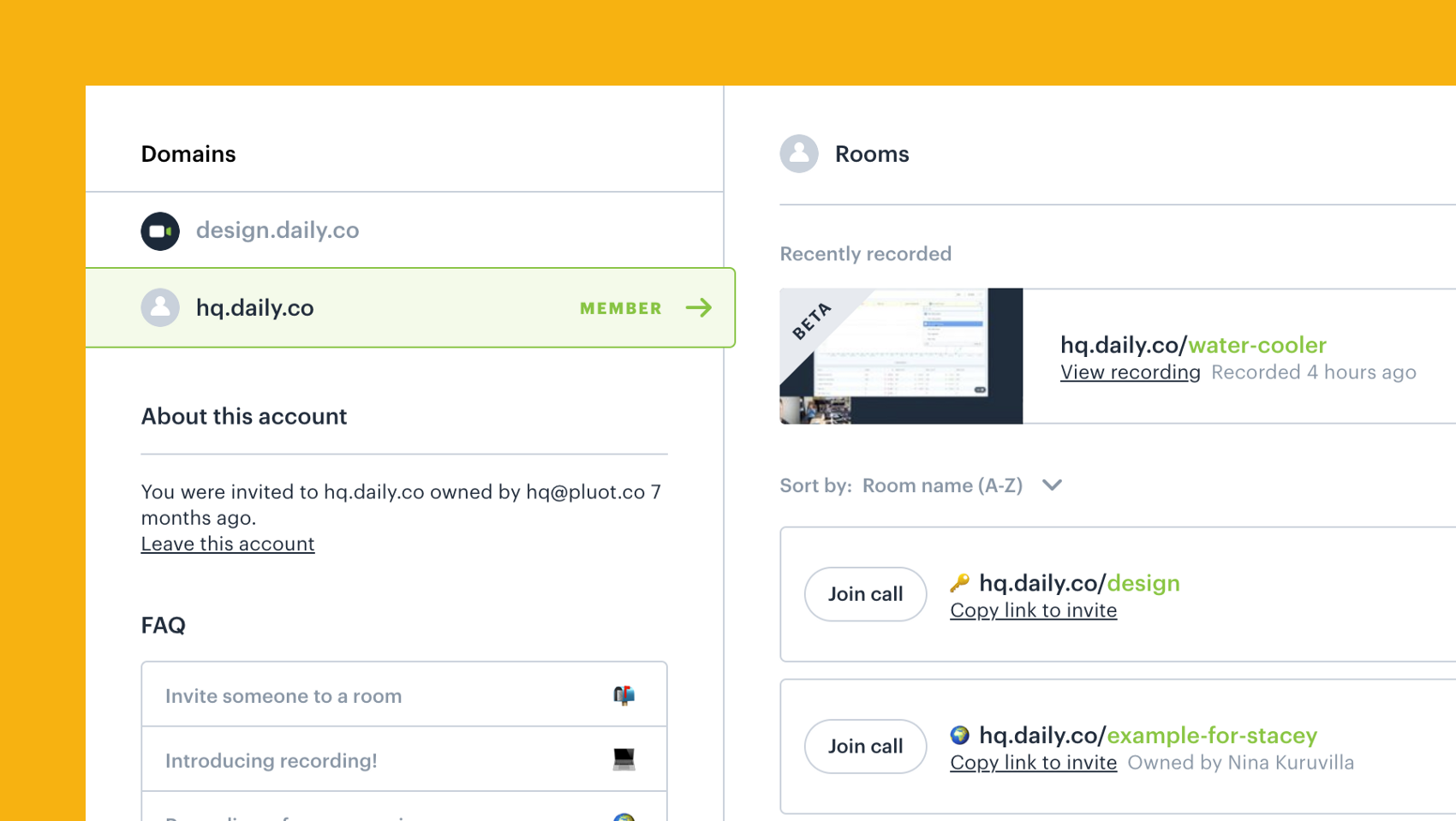
To solve for this we've added a notification component to the top the dashboard for new visitors. There's logic built into our code which allows us to only display the test call notification to users who match our criteria. Also, all new accounts are given a room named "/test-call" which, while no different than any other room has some more UI to help guide users.
Make inviting team members more prominent
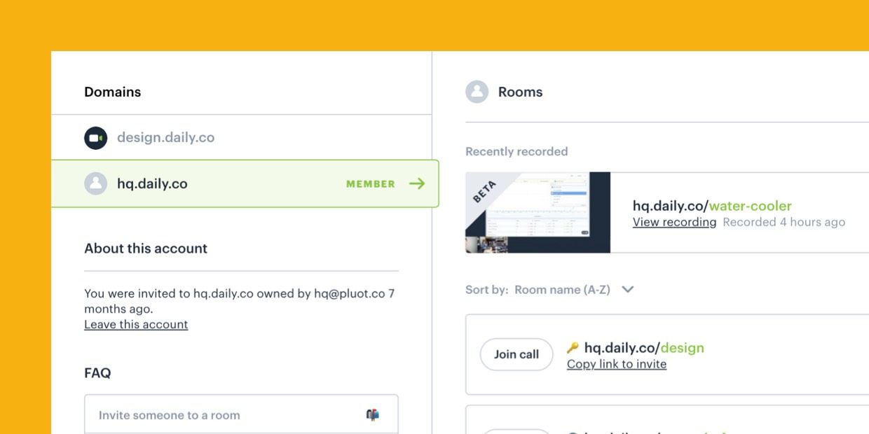
Here we settled on moving the team management UI to the left side of the screen. This mimics other dashboard interfaces like Dropbox Paper, Google Drive, and many more. By following convention we believe that the team UI pops some more and makes for a clearer mental separation.
In the design above design.daily.co is the active "Domain." No members have been invited so the UI prominently highlights inviting others.
Clearer call-to-actions for: copy meeting link and join call
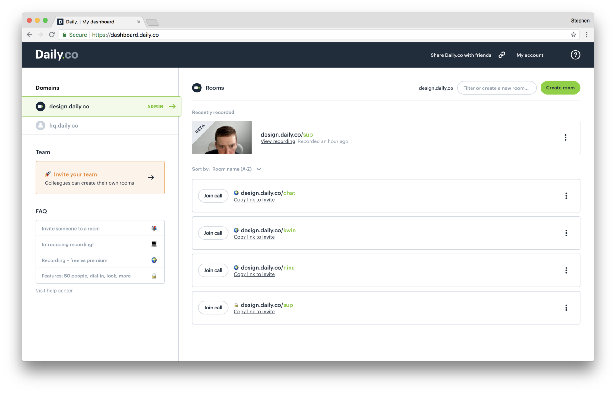
Through user feedback we discovered that some folks had trouble discovering how to join a room. Our old room row component did not have a prominent Join call button; you had to hover over a row in order to join a call.
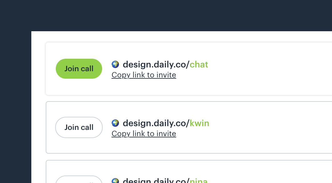
To mitigate this confusion we've removed that trickery. Now the button is just there! Also, we've added a text link that copies the meeting link to your clipboard (your link is your room). You can quickly share your meeting link with a friend or colleague over chat, email, whatever!
Organize teams/rooms
Previously we did not separate teams in our UI. If you were a member of multiple teams, the rooms list became very difficult to parse; all rooms, regardless of the team they belonged to, were shown under the same list.
Now, your teams are broken out into tabs. In the example below selecting design.daily.co only shows rooms associated with that team. Phew!
Make it easier to sort your rooms
For power users, who are members of multiple teams or have a lot of rooms we've added sorting functionality to the rooms section. You can now easily sort rooms by room name or owners name. Look for more sorting options soon, like sorting by most recently recorded, or last visited 😉
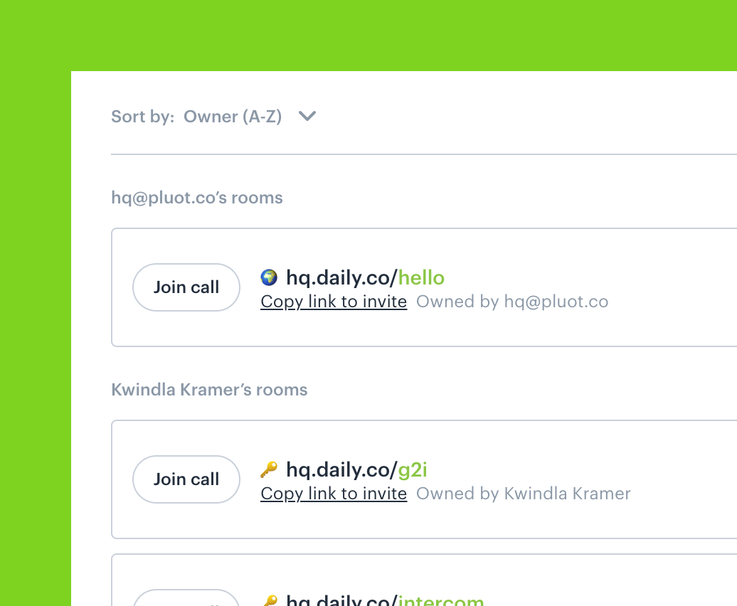
By default we display your teammates' names. If they haven't added one to their account, we'll show their email address.
Long post, but product development is tough work. From all of us at Daily.co I hope that the new dashboard experience makes your job simpler. We'd love to hear what you think!
I also hope that this post gives you a glimpse into how the sauce is made. We're constantly revisiting our workflow to improve how we build our video calling software.
As I mentioned at the top of the post we've just launched beta meeting recording as well. Go ahead and sign up or log in to your Daily.co account to give it a shot. Local recordings are free during/after beta while cloud recordings are free during beta and will cost $20/month/room for unlimited recordings.
If you have any feedback, questions or comments please, do not hesitate to contact me or chat with us directly on our site.
Cheers! 👋
Never miss a story
Get the latest direct to your inbox.