
Creating components in Figma is quite a bit of fun. There's something about Figma that encourages good design practices. Follow along to learn some rules we use in order to help us when designing user interface/experience components.
Before we begin, you may be asking, what is a component? For our design team here at Daily.co a component can quite simply be defined as a "reusable piece of UI". If you're unfamiliar with UI components that may be rather vague. So in this post I will highlight some principles that we follow in order to help us decide when we should turn UI into a component.
If you are unfamiliar with the mechanics of a Figma component, I'd encourage you to read this post, written by Rasmus Andersson, on the Figma blog.
Many of the principles underscored below could 100% be applied to other design tools — Sketch, Adobe XD, etc. Now, let's dive in!
Principle #1: Components should be designed whenever UI is reused
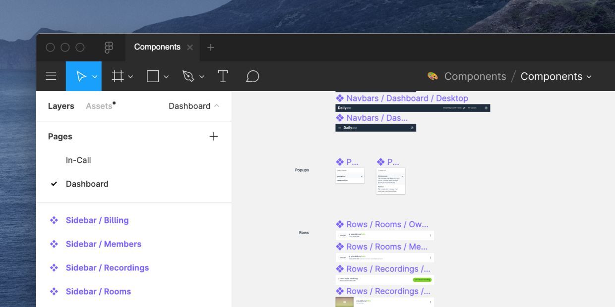
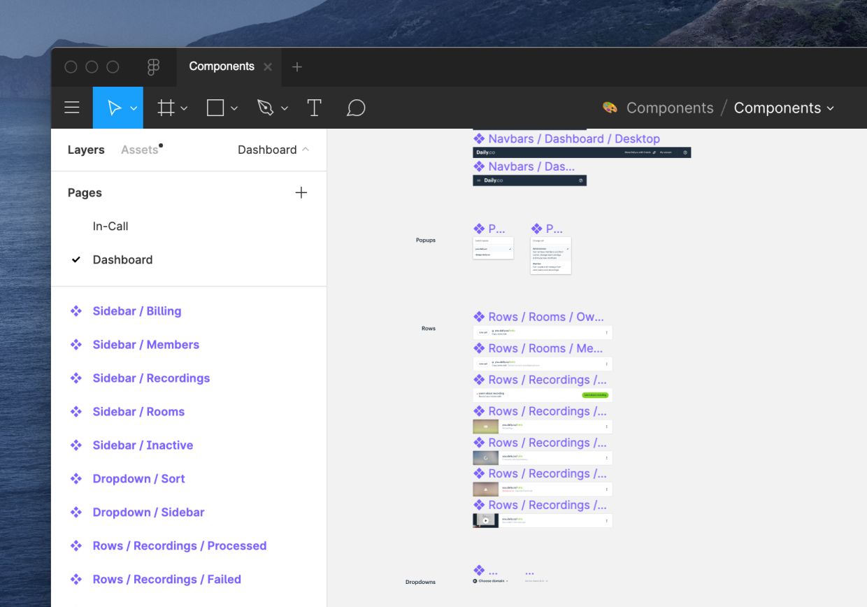
Buttons and forms are obvious components. However, we also design components in Figma for things such as our video call controller, in-call menu, dashboard rows and much more. All of these types of components are re-used throughout our interfaces.
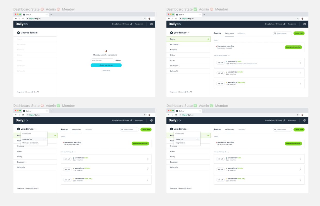
In the image above there are over 10 components reused across the dashboard UI states. Many components included nested components. Which leads us to our next principle.
Principle #2: Components can be nested within one another
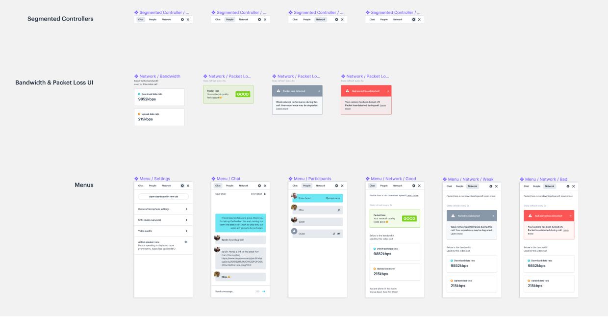
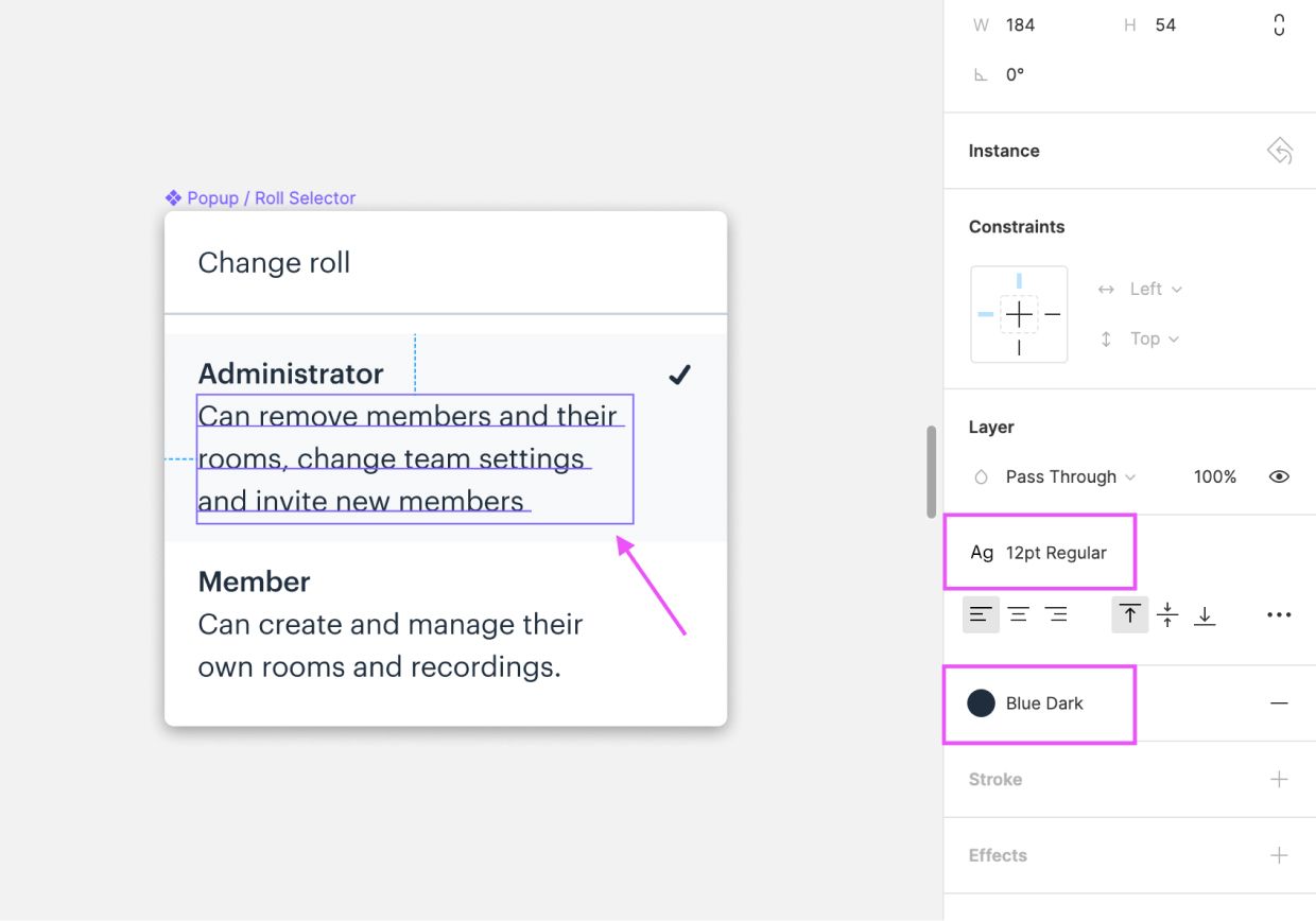
Components can, and often times should, be nested within one another. For example our in-call menu is comprised of segmented controller and button components.
You may have heard the term atom used to describe lower level symbols, like buttons. Many of our components could be thought of as atoms, yet we've strayed from that thinking for now.
In the example above you can see that we have a master Segmented Controller component, which is then nested as an instance in the master Menu component. To learn more about different approaches to components and their instances, check out this blog post from Roman Kamushken.
Principle #3: Components can contain both UI and UX patterns
Our components are certainly pieces of UI. Yet they also should behave consistently throughout our UX. For example, the way that banners animate is designed to be consistent and expected behavior.
Our goal is to remove false expectations from our users. They should expect consistent interaction patterns between UI components.
This also means that components are designed to be adaptive and responsive. We design for desktop computers (mouse input) and touch screen displays. So while we must design responsive components we also must remember to design interactions/UI for smartphones and tablets, as well.
Principle #4: Component UI should use our styles (fonts, colors, icons, etc.)
Visually our symbols are made up of a consistent set of UI styles. These styles live in a separate Figma file — more on that in a future post — which we reference in our components file.
Having a predefined set of fonts, colors, icons and more helps us to maintain visual symmetry. It also helps speed up our front-end implementation.
Principle #5: Components should follow a naming structure.
Last but not least our components should follow a consistent naming structure. Typically we know we may "componentize" UI when it can fit into a naming matrix.
In Figma — and Sketch alike — you can name components so that they are nested. A typically naming structure is:
- Button/Large/Default
- Button/Large/Hover
- Button/Large/Press
- Button/Large/Focused
- Button/Small/Default
- Button/Small/Hover
- Button/Small/Press
- Etc.
There are many different ways to name your Figma/Sketch components. You should find what works for you and your team. Jake Tsacudakis has a great post in which he talks about the pros and cons for different methods of organizing and structuring components, in Figma.
For us, at Daily.co, we do not create components with "hover" and "focused" states in our Figma files. While I can see the value, we tend to handle these states with an interactive prototype. One that's created in HTML/CSS or with a tool like Principle.
Maintain consistency, encourage creativity
It's easy to get in the habit of creating a component for everything. Heck, it's fun to create components and play around in Figma. At the same time, having principles for your design practices can help maintain consistency while encouraging creativity.
For our design team we believe that our Figma components should maintain 1-to-1 consistency with our engineering components — we use React so there's a nice level of coalescence to be found.
Maintaining uniformity in our designs helps our users navigate with less friction. This also enables us — as creatives — to explore different design tactics for new UI projects. While I would encourage you to think about developing components, I'd equally persuade you to delight users throughout their experience.
Component libraries, design systems and style guides are simply tools for building experiences. While we should be thoughtfully consistent, we, as designers, should also be flexible with our systems. Here at Daily.co, as a young startup, our design language needs to be malleable — for both our users and business alike.
Never miss a story
Get the latest direct to your inbox.