
[2022/02/01] Daily Prebuilt's UI has been updated since the time of publishing this article. Check out our most recent Daily Prebuilt announcement post for more information.
It’s often difficult to compartmentalize the design of a product while you’re designing it. Product design is not linear. Rather, it is full of highs and lows, peaks and valleys.
As a designer, I lavish time over the complex design systems that teams like Airbnb, Google and Dropbox have developed, and shared, with our community. Yet as the Design Lead for Daily.co, I know that our design system has had to materialize with time.
User feedback, patience and teamwork has molded the design language of our brand. Not 10,000 hours designing in a vacuum.
And I’m certain that the same is true for those aforementioned companies.
Our API is the latest culmination of knowledge after many years of building video calling products. And we are excited to see teams beginning to use it in their products.
My hope is that this post provides more context for you to choose how to build with our API as we have a few design options:
- You can embed UI-ready calls with our prebuilt widget.
- Alternatively, you can customize the UI of your embedded calls.
Should you just wish to use your widget (which includes UI/UX), I hope this post gives you more context about the layout of your video calls! If you’re choosing to customize the layout, here are some key things to keep in mind as you integrate video calls — with our API — into your product.
Core UI
When designing a video call interface we naturally think that the video feeds or grid are the most important components. That may be true, yet there are a few other elements that we’ve learned are actually more important to our users.
Join and leave UI
Our API gives you the ability to customize a video call experience for your product. That said, you must design the experience that enables your users to “join” and “leave” a call outside of our APIs embedded video call iframe.
How your users join a call while in your product is an important UX to think through. Similarly, where do your users land when they leave a call?
Call controls
For starters, in-call controls should always be accessible and usable. Many products take different approaches here. For example, Google Hangouts (historically) does not display UI labels. While Zoom, on the other hand, hides the in-call controls until a user hovers over the interface.
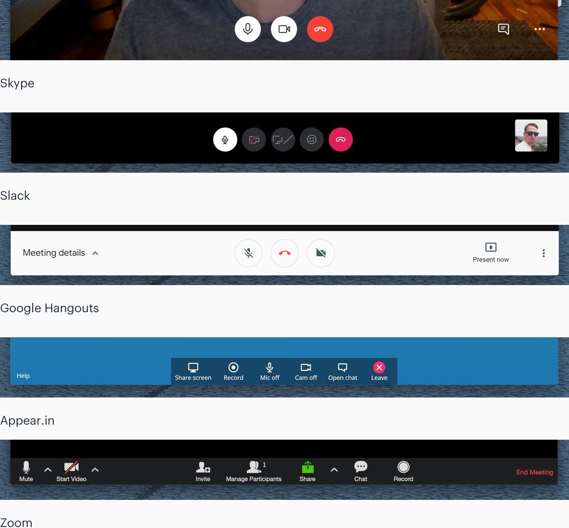
Our product has evolved too. A few years ago we actually had quite a bit of logic in place to hide the in-call controls under certain scenarios.
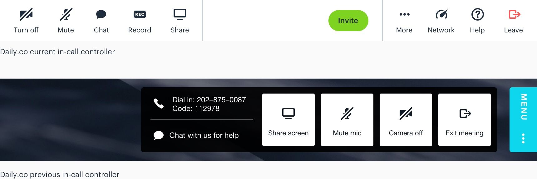
We have now had the same design in place for roughly the past year. Through user feedback — and lots of dog-fooding our own product — we have developed in-call controls that allow users easy access to control their camera and microphone. The two most important controls for video call participants.
As we’ve cycled we have found that using dynamic labels, in addition to iconography, has provided the best end user experience.
Local camera
Second to call controls a participant's local camera feed is may also be a critical component of your video call UI. Assuming you are using video 😀
We humans are self-absorbed or rather, in the case of most of us, self-conscious. We’ve run heat map tests and it’s actually astonishing how many of us pay attention to our own video feeds.
People use their local video feeds as mirrors. We are constantly checking our hair, expressions, etc.
When developing UI, keep in mind that the local feed is a rather critical component your video call UI.
The video grid
The main video grid, where remote participants typically live, is of course another key component to any video call UI. Being able to clearly see other participants is very important to any video UX.
That said, you do have some more flexibility with this component. The size of your viewport and any other on-screen UI may take priority over the main grid.
If your users are working on less than ideal networks than you may want to programmatically turn off remote video feeds. Pro-tip: we’ve made this logic available to API calls. It's built into the prebuilt widget, for example.
Contextual UI
There’s many additional components that you may need to design UI for. In our experience these components are secondary to the UI mentioned above.
This UI level is secondary to the core product experience. In the context of our API, this UI is tied to features that are disabled by default. For example, text chat or recording must be enabled by a developer.
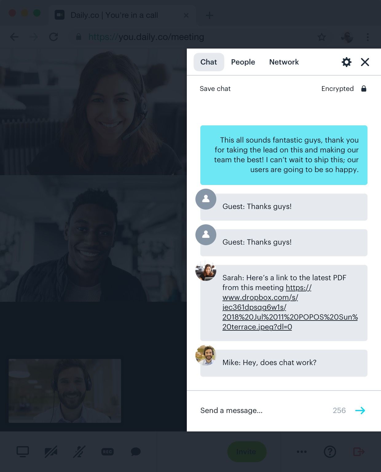
In-call text chat
A good example is our text chat interface. It is intermittent in that a user invokes the UI as needed. Think of this UI has a boolean of, visible/hidden. Your users can toggle the UI on and off without interrupting the core video call UI.
Banners
The use of a banner component is another common UI element. We’ve found them to be useful should we need to provide feedback for a recurring task. For example, when someone has started a video call a banner is a rather minimal component that can provide signal to your users.
Like modal UIs (below) we do not recommend layering banners. Only one should be visible at a time.
Modal UI
Moving down, or up a level — depending upon how you’re visualizing this UI cake — we have modal interfaces. These are interfaces that force a user to take an action.
Across the web your sure to find many articles advising for and against the use of modals. Our general rule of thumb has been that only one modal UI can be visible at a time. The window should never be stacked with modals.
Here are a few examples of modals used throughout our UI.
Error messages
One of the most commonly thought of components for a modal UI might be an error or warning message.
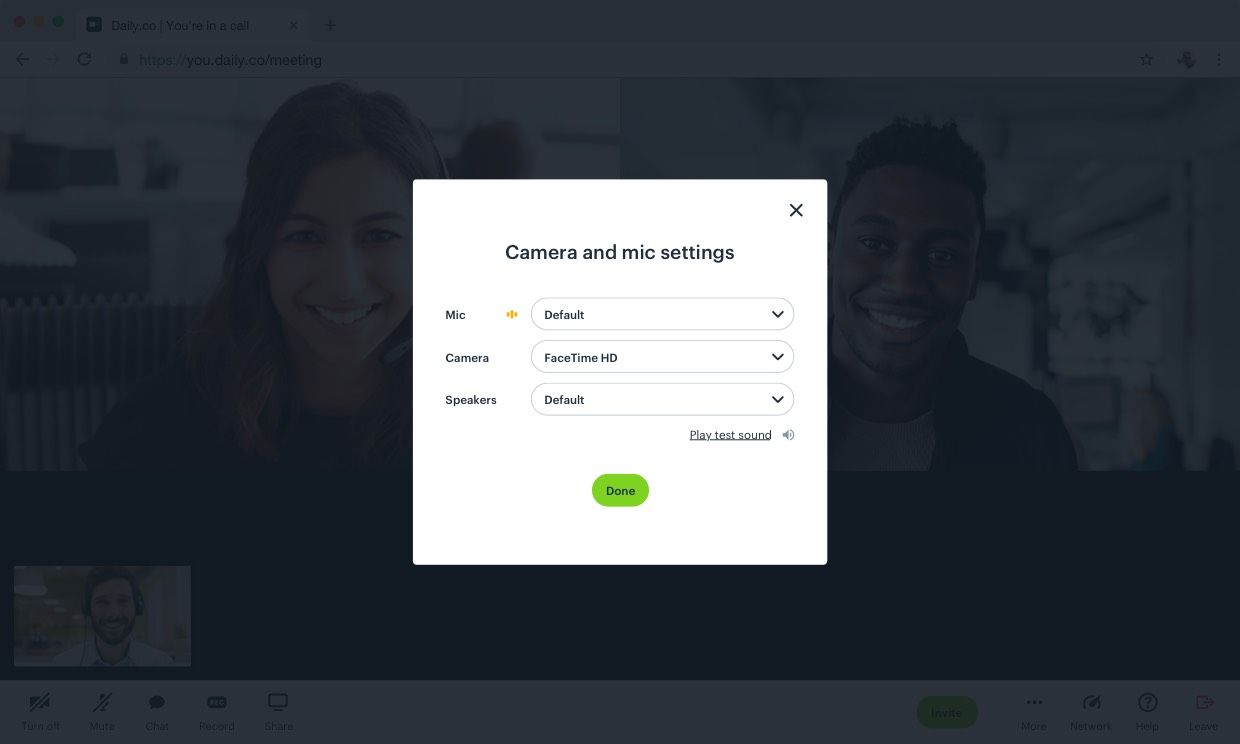
Device switching
In our UI we also use modals for device switching — changing the microphone input.
Notifications
Finally we have contextual interface elements and notifications. These types of UI provide information should events occur in the background.
Should you choose to use change the privacy setting of meetings links and require guests to “knock” to enter, notifications may become critical UI.
Think through how you might inform meeting owners that someone is requesting to join a call.
You’ll also need to design UI for the person requesting to join the call. This UX would live outside of the video call embed; it is a component of your products structure.
We hope that this post can provide some higher level UI guidelines for those who are looking to design custom UI with our API. Depending upon the features you elect to enable, your workload may change.
Be cognitive of the different levels of UI:
- Core: controls, local camera, remote grid
- Contextual: menus, in-call text chat, banners, etc.
- Modals: something occurred and needs your attention
- Notifications: someone did or is asking X
Our UI is constantly evolving. Surely, we will continue to massage these design paradigms as time passes by and we learn more from our users. However, the anatomy of our interface outlined in this post provides valuable guidelines for when we develop a new feature that requires UI.
Never miss a story
Get the latest direct to your inbox.