


As the saying goes, “All good things must come to an end,” which also happens to be true for video calls.

There are several options to consider in terms of the user interface (UI) design and user experience (UX) of how participants leave a video call. In this post, I’ll review some of the most important factors to consider when implementing a Leave button in your video app. To demonstrate these factors, I’ll review the design of the Leave button in Daily Prebuilt – Daily’s video component that can be added to any web app in just a few lines of code.
By the end of this post, you'll see what makes Daily Prebuilt's Leave button design so intuitive, and how you can use similar principles in your own app.
Overview
In this post, we’ll discuss both technical implementation options when building with Daily, as well as more general design decisions to building a user-friendly call-leaving flow.
In terms of the technical decisions, we’ll look at:
- Daily’s
showLeaveButtonproperty for Daily Prebuilt. - How to create a custom Leave button that uses the
leave()instance method from Daily’s Client SDK for JavaScript.
In terms of design, we’ll look at:
- Where to place the Leave button in your UI.
- How to style the Leave button to ensure users only click it when they actually intend to.
- What to show in the UI after a user leaves a call.
- Whether your Leave button should trigger an alert to confirm the action before invoking the
leave()method. (Probably not.)
Even though the Leave button might seem like such a trivial detail (don’t tell your designer that), it is important! Think about any time you’ve said goodbye in a call and went to click the Leave button, only to see an unexpected pop up asking if you really want to leave. Instead of a call ending, you got to experience a few seconds of awkward smiles and pure panic.
Similarly, you might have:
- Not been able to find the Leave button and had to close the app or browser tab instead.
- Accidentally left a call because you clicked Leave instead of the button you meant to click, like Mute.
- Had a call auto-end and then had to double-check that you weren’t still somehow in the call. (We have all seen the pandemic-era videos of people accidentally still being in a call or being unintentionally unmuted. They usually end with someone saying something that did not need to be shared with other call participants! And, in case you haven’t, Google “Lukas Gage audition”.)
The Leave button is a small detail, but it can have a big impact on the user’s experience.
Ultimately, the goal is to make sure the call participant knows their current state in a call and also knows how to change it when they want or need to. Plus, a happy user helps make for a successful app 💸
Technical implementation considerations with Daily’s Client SDK for JavaScript
In terms of the technical considerations for leaving a call, let’s start with Daily Prebuilt. By default, Daily Prebuilt does not show a Leave button when it’s embedded in your app. Showing the Leave button requires including one option when instantiating the call frame:
const callFrame = window.DailyIframe.createFrame({
  showLeaveButton: true, // <- this one!
});
callFrame.join({ url: 'DAILY_ROOM_URL' });
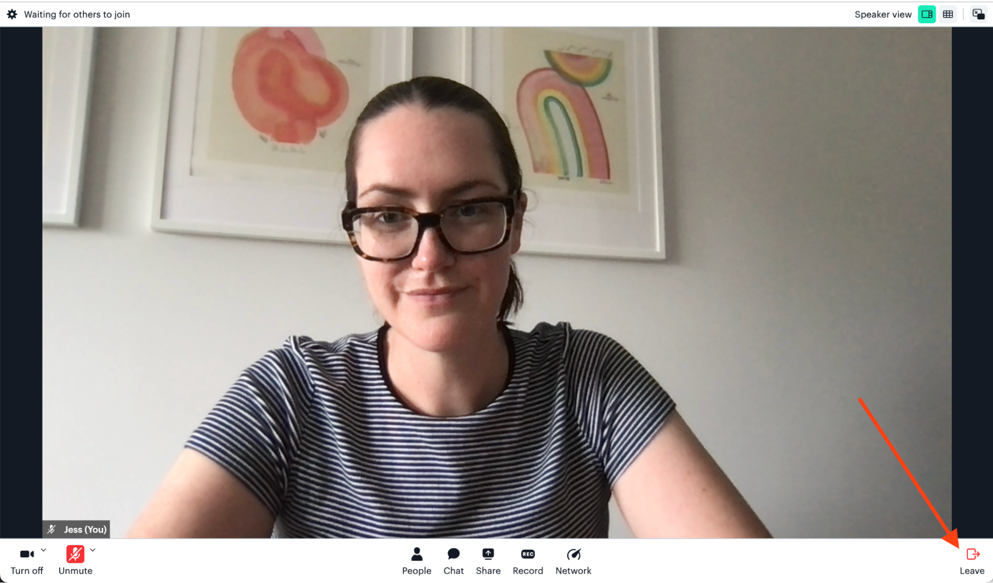
When this option is added, the Leave button will appear for the user entering this room via Daily Prebuilt:
Building a custom Leave button
If you’re building a custom UI with Daily’s Client SDK for JavaScript or you want a custom Leave button instead of Daily Prebuilt’s default one, you can build a custom button that will let call participants leave the call. (To see an example of Daily Prebuilt with a custom Leave button, see our Daily Prebuilt demo app.
First, you need an HTML button to accommodate the user interaction (a button click):
/* this is JSX from a React component but you can use plain HTML too */
<button onClick={leaveCall}>
  Leave call
</button>
Note: See this code in context in our Daily React Hooks demo
Then, we need some JavaScript to handle the button click:
const leaveCall = () => {
  // The callFrame variable should already be assigned to an instance of the DailyIframe class:       https://docs.daily.co/reference/daily-js/daily-iframe-class
  callFrame.leave();
}
In this function, Daily’s leave() method is invoked to remove the local call participant from the call. The leave() method returns a Promise and triggers the ”left-meeting” Daily event, either of which can be used to add clean-up actions after leaving. For example, you may want to reset your UI or destroy the call frame, depending on your app requirements. (What happens after the call participant leaves will vary between apps.)
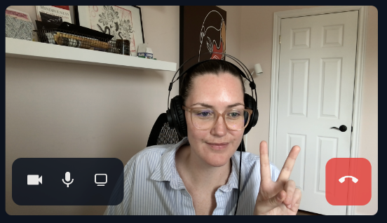
One example of a custom Leave button that differs from Daily Prebuilt’s design is an app that doesn’t have a tray at the bottom of the video call UI. Our Daily Svelte demo, for example, has the Leave button overlaid on the local participant’s video tile instead.
Design considerations for your Leave button
Now that we have a Leave button – whether it be Daily Prebuilt’s button or a custom one – we can discuss its design.
Daily Prebuilt’s Leave button demonstrates all the points I’ll cover today, so let’s first brush up on what it looks like:
First things first: Include a Leave button
This might go without saying, but it’s good to include a Leave button in your video call apps.
In calls where you really want participants to stay in the call, like cases of important training or an all-hands, you might at first consider removing the Leave button to encourage them to stay. This is not ideal for most use cases. This is not ideal.
When an app has a “dead end” (i.e., the user can’t intuitively cancel or revert an action they took, or they’re stuck in one view), it can make them feel trapped. No one wants to feel forced to do anything. Yes, a user can just close the tab or application to force-quit your call. But users typically feel more positive about an app when they feel in control of how they’re interacting with it.
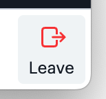
Using red to warn call participants
One of the first important factors to consider is that the button has a red icon. The color red typically indicates a warning that the associated action will be destructive or that you should be cautious in some way.
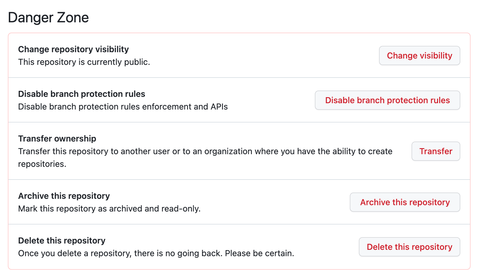
Another example of this is GitHub’s “Danger Zone” in a repo’s settings. All actions are red to indicate there’s something potentially “dangerous” about the associated actions.
By making the Leave button’s icon red, we can visually indicate that the call participant should be cautious when clicking. (The same logic can be applied to the unmute buttons since it can be pretty embarrassing to unintentionally turn on your microphone or video.)
In this case, the color red helps emphasize the button and the message we’re trying to send to the user (i.e., to be careful clicking this). The button also includes the text “Leave” underneath the icon. This helps color blind users who don’t see that it’s red, as well as anyone who doesn’t recognize the meaning of the icon.
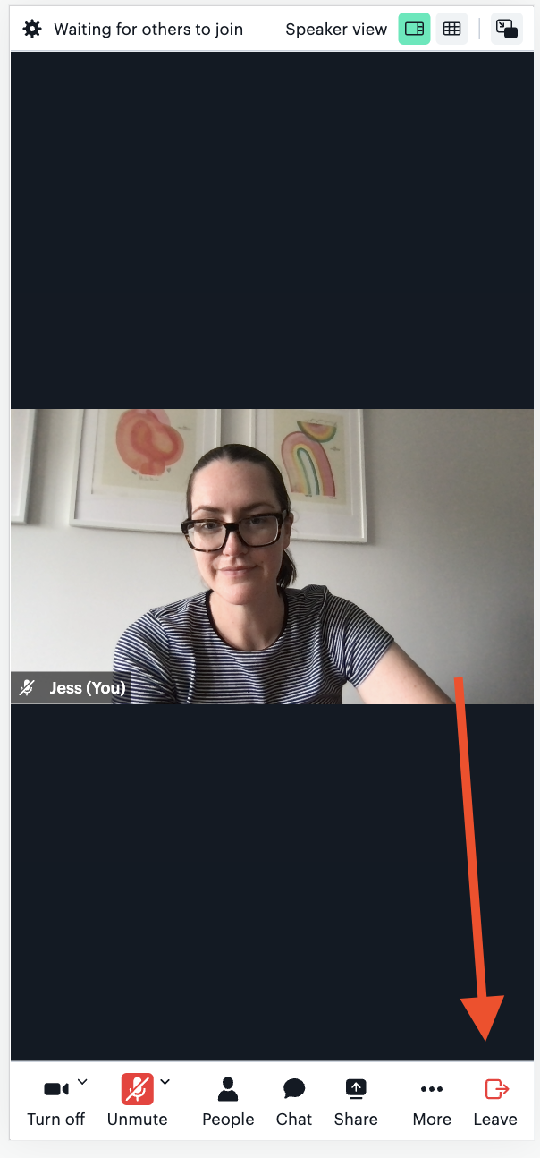
Putting the button in an isolated location when possible
As we see in the screenshot above, the Leave button is as far away from the other buttons in the tray as possible. This helps make sure call participants don’t accidentally click the Leave button when they mean to click something else, like Mute.
By doing so, users will know that clicking in the bottom right corner is only associated with leaving the call. For any other action, you’d have to click in a different area of the app.
The only time this could cause an issue is when you consider other user behaviors that may happen in the bottom right corner of the window. For example, a user will commonly resize the browser window by clicking and dragging the bottom right corner. To avoid accidentally leaving the call when trying to resize the window, a bit of padding is added between the button and the window’s corner to help avoid the two actions interfering with each other.
Even in the mobile version of Daily Prebuilt where the tray is much smaller and the Leave button can’t be completely isolated, it is still located in a low-risk spot: next to the More menu. When clicked, the More menu opens a menu with additional actions. This means if you accidentally press More instead of Leave, there’s no unintended side effect that occurs – it just shows the menu.
You may be wondering, “Would it be better to put the Leave button in the More menu so it’s in a safer spot?” You could do this, but that brings me to my next point: don’t make it hard to leave a call.
Letting call participants leave the call immediately
In some video call apps, an alert will show after you click the Leave button that says something like, “Are you sure you want to leave the call?” This can be useful for calls where it would be frustrating to accidentally leave, like an important call where you don’t want to miss anything or a private call where the host has to let you back in. (As a host, it can be distracting to get notified that someone’s trying to join the call when you’ve already started speaking.)
That being said, if you’ve already designed your app so that the chances of accidentally clicking the Leave button have been minimized, you probably don’t need to worry about adding this extra alert. In most cases, the call participant did mean to leave. So, if you add an alert, instead of ending the call when they meant to, the call participant is faced with an alert that they then have to read and respond to. It might not seem like a big deal, but it can be awkward to be prompted unexpectedly for a decision when you’re just trying to leave!

Daily Prebuilt avoids this awkwardness by just ending the call when you click Leaveto leave. There is a trade-off here because there will likely still be some people who click the Leave button by accident. However, we trust this number is small. Plus, in most cases, re-entering a call is not a big enough hurdle to create the extra requirement of making everyone interact with an additional alert.
Note: One use case to consider when an alert can be useful is when the expired (or exp) option is configured for a Daily room. This is because call participants cannot rejoin a Daily room if the expiration time has passed and they leave the call. 😂
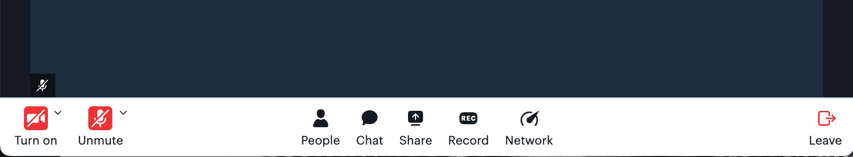
Showing a message after the call participant leaves to confirm they left
There’s nothing like thinking you’ve left a video call and saying out loud, “Why wasn’t that call an email?” and then hearing, “Jess, you’re still in the call,” to teach you the importance of a confirmation screen.
In general, it’s good to give users feedback on any action that they take. That’s why we – us front-end developers – do things like show loading screens and success messages after submitting forms; you want the user to understand what’s happening in your app.
Daily Prebuilt helps call participants know they’ve successfully left the call by showing a message confirming the action was successful.
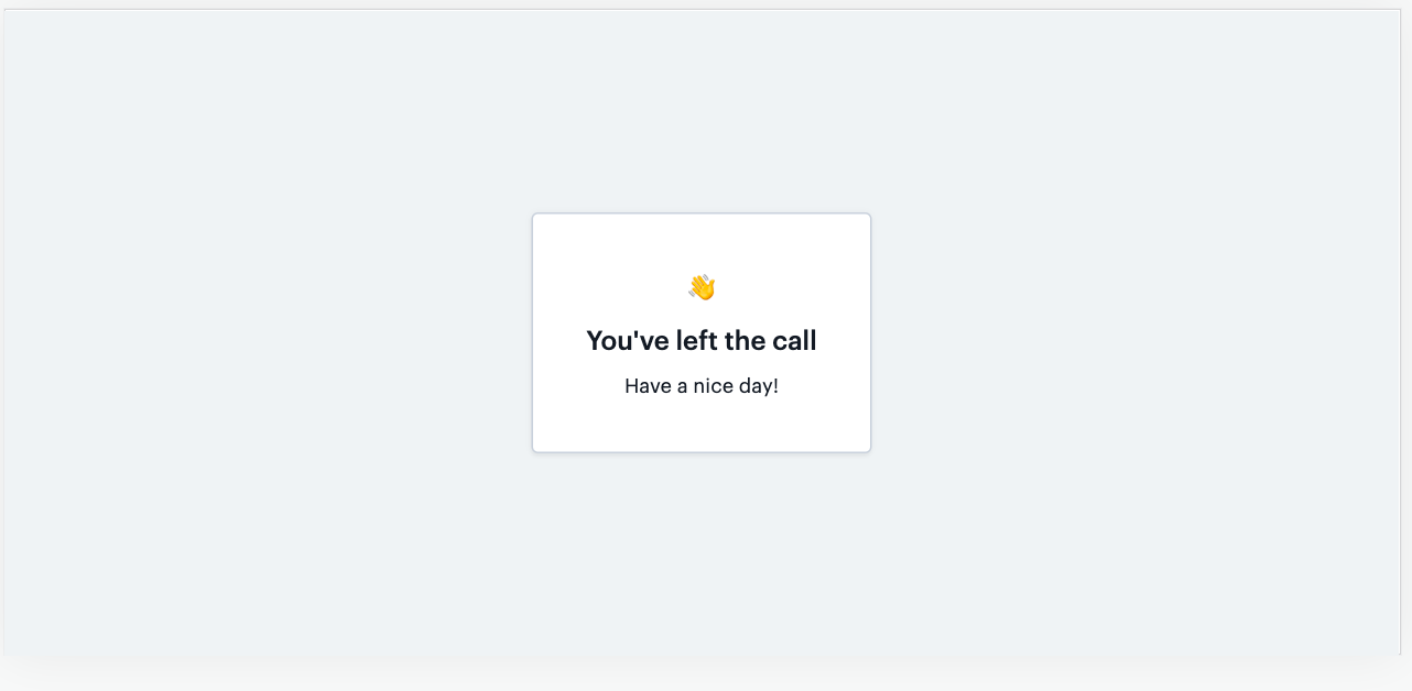
This is useful for a couple of reasons:
- It confirms they are no longer in a call.
- It ends the call in a friendly way. Design choices like this can impact your users’ overall feeling towards the app. Video calls can sometimes feel less personal than speaking in-person, especially if you end a call and are sitting alone in your home office afterwards. It’s nice to keep the interaction friendly and end on a positive note! (As another example of how copy choices can impact users: an early version of Daily Prebuilt said “You are alone” instead of “Waiting for others to join”. It may or may not have put me in an existential crisis right as my meeting was about to start.)
Conclusion: Rules of thumb
Overall, we can sum up these recommendations by saying it’s best practice to let the user be in control of how they experience the video call, including when they are (or aren’t) in it.
More specifically:
- It should be visibly clear how to leave (e.g., make the button red) so the user doesn’t have to search for the button. For accessibility reasons, the Leave button should also be accessible with interactions other than mouse clicks, such as keyboard interactions. Here’s our tutorial on implementing keyboard shortcuts to help support this.
- The Leave button should be placed somewhere that’s convenient to access when needed but also not easy to accidentally click. The user’s intended action should match the outcome.
- It should be easy to leave (e.g., just one click with no additional alerts is sufficient for most use cases).
All of these considerations add up to a seamless call experience. It enables users to avoid awkwardness, confusion, disruptions, and saying things that aren’t meant to be heard by the company’s CEO.
A lot of the time, the best design is captured by the decisions that users don’t actually notice. This is because any possible inconveniences were removed before they could become issues. A well-designed Leave button is a great example of that!
Never miss a story
Get the latest direct to your inbox.