

VCS is the Video Component System, Daily's developer toolkit that lets you build dynamic video compositions and multi-participant live streams. We provide VCS in our cloud-based media pipeline so you can access it easily for recording and live streaming via Daily's API. There's also an open-source web renderer package that lets you render with VCS directly in your web app --- this way, you can use any combination of client and server rendering that best fits your app's needs.
Since its introduction on Daily as a beta feature last year, VCS has gained dozens of features based on requests and ideas from our customers. We're now getting ready to take off the beta label. That means the API and feature set are very close to stable, and it's a good time to take a look at all the new stuff that the platform has added.
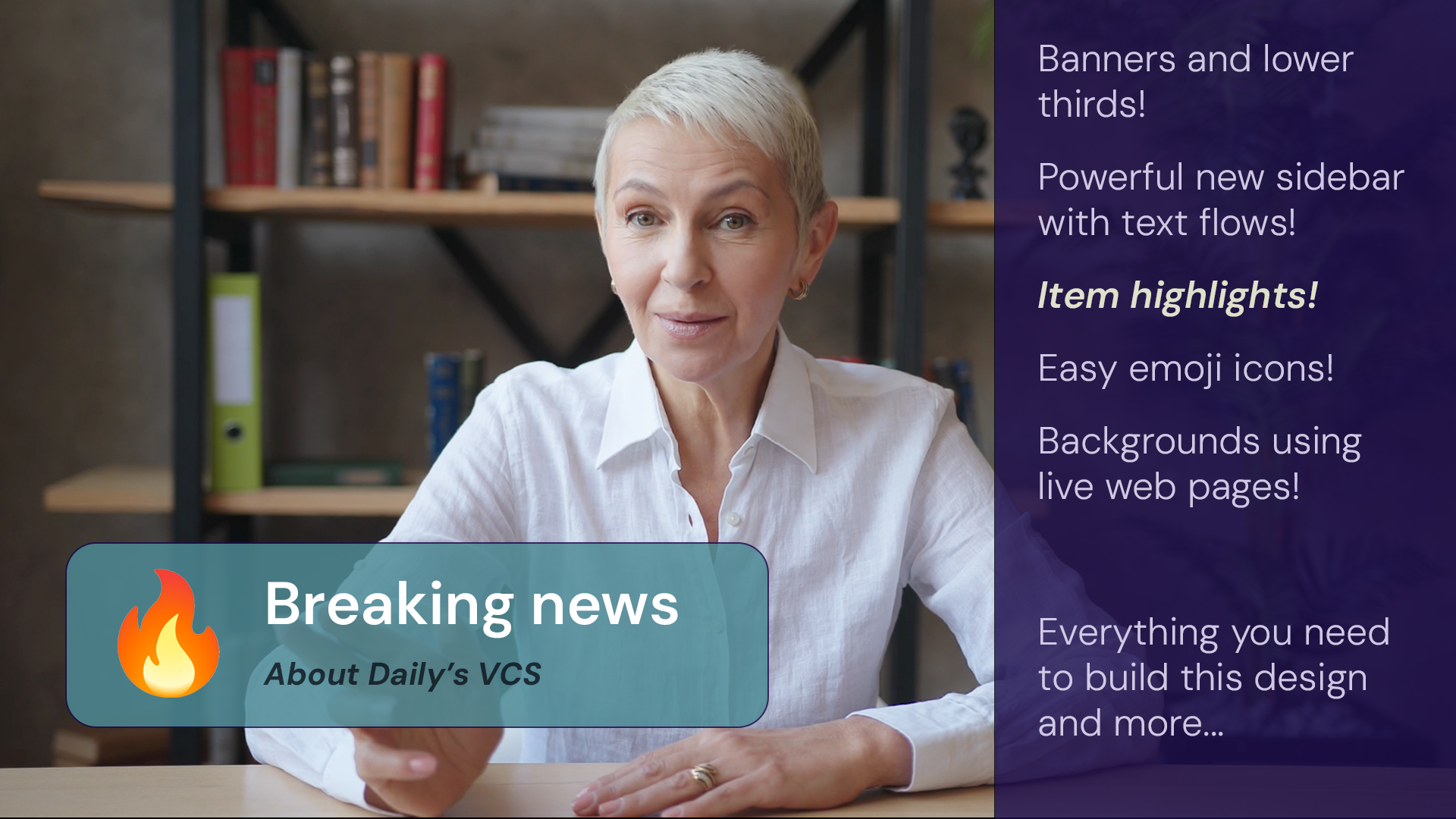
What you're reading now is the first in a four-part series of posts covering new features in VCS. In this initial outing, we'll be looking at two new overlay graphics options for richer dynamic visuals. We'll see how a new "highlight lines" data source can be used to provide content to the various graphics overlays. We'll also look at ways to use content behind video elements. You can now use VCS WebFrame as a full-screen live background, which can make it easier to port your existing web-based UIs to VCS for recording and streaming.
So, this first post is about new tools and options for motion graphics and background content. The upcoming second post will focus on customizing video elements and their layout, and will also explain some new debugging tools related to rendering Daily rooms in VCS.
The third post in the series will cover new ways to link data sources into a VCS composition. These will let you render chat, transcript, and emoji reactions automatically. Finally, to conclude this series, we'll be unveiling new open-source libraries and code releases that make it possible to use VCS in your own real-time apps and even offline media pipelines and AI-based automation. So it's going to be worth checking back here regularly!
New graphics overlays
Before we look at the new graphics options, let's have a quick refresher. VCS is a React-based toolkit designed specifically for video compositions. It is open source. There are two parts to the project: the core and the compositions.
The VCS Core project interfaces with the React runtime and provides built-in components like Image, Video, Text, and so on. But it's just a framework. To render something, you need a program that uses VCS. These programs are called compositions.
You could write your own composition from scratch using the VCS tools, but to make life easier, we at Daily provide a baseline composition which includes a rich set of layout and graphics features. When you start a recording or live stream on Daily's cloud, the baseline composition is enabled by default. You can control it by sending parameter values for things like changing layout modes and toggling graphics overlays.
The VCS SDK includes a GUI tool called VCS Simulator which lets you control a composition's params interactively. We provide the baseline composition's simulator online, so you can easily experiment with the various params available.
There's a lot of params already, so the simulator is quite dense! But don't be discouraged from experimenting. In this blog post, when you see a mention of a composition param such as "showBannerOverlay", you can always try it out interactively within the simulator linked above. It's the best way to get a handle of how these options really work.
Banner
Now let's take a look at the new visual components in the baseline composition, starting with Banner.
The Banner is an overlay with a title and a subtitle. In its default configuration, the Banner is placed in a spot commonly known as "lower third" in television graphics. It's a staple of TV design because it's often used to show the identity of the person speaking, like this:
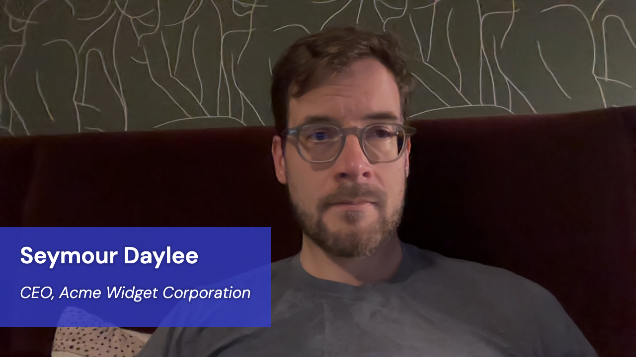
You can see how "lower third" got its name — the overlay box is located in the lower third of the screen. Following the usual rules for TV videography composition, this leaves enough room above the overlay for important content like the person's face.
The above screenshot shows the default styles of the Banner component. The two fonts, text colors and background color can all be configured separately.
To display this component and set the two text values, you can use the following composition params:
call.startRecording({
  layout: {
    preset: "custom",
    composition_params: {
      "showBannerOverlay": true,
      "banner.title": "Seymour Daylee",
      "banner.subtitle": "CEO, Acme Widget Corporation"
    }
  }
});
For more information on how to pass VCS composition params when starting/updating a recording or live stream on Daily, see this guide.
For details on all the composition params that are available for the Banner component, see the startRecording reference under the heading "Group: Banner".
It's possible to omit the subtitle entirely if you want just a big title. For that configuration, pass an empty string for banner.subtitle.
The Banner component can also contain an optional icon, and you change its size:
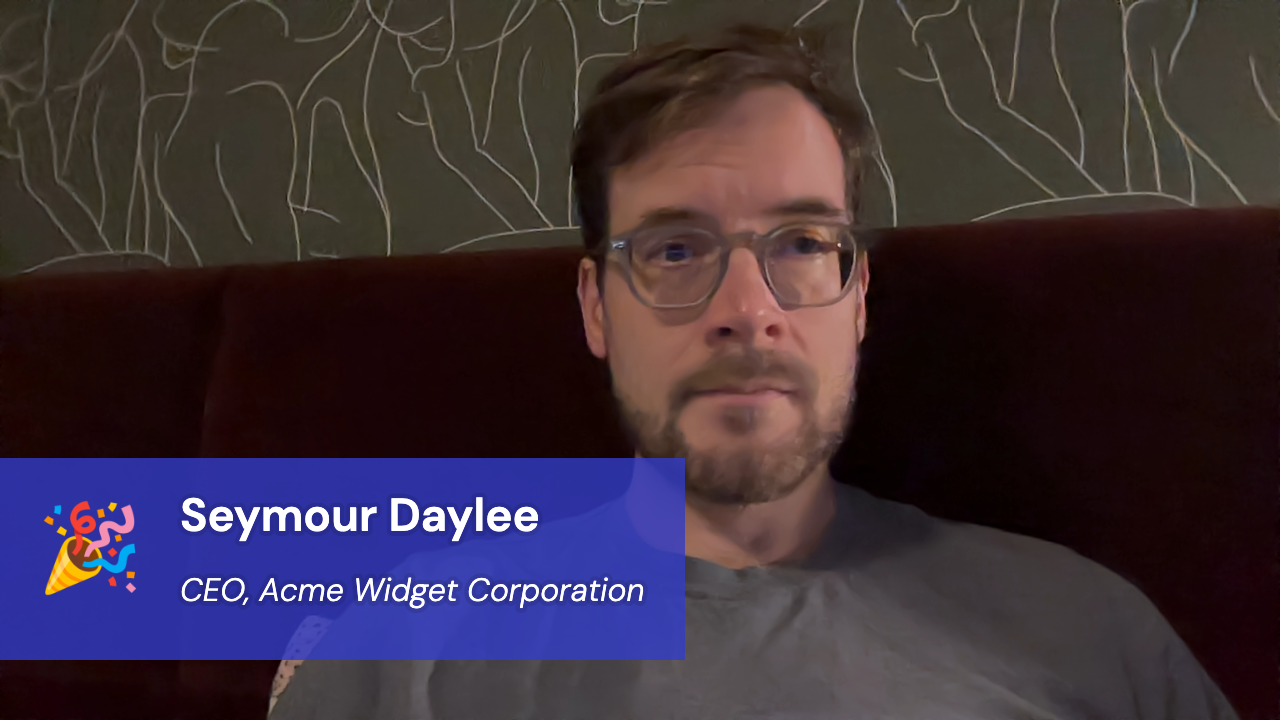
    composition_params: {
      "showBannerOverlay": true,
      "banner.title": "Seymour Daylee",
      "banner.subtitle": "CEO, Acme Widget Corporation",
      "banner.showIcon": true,
      "banner.icon.size_gu": 5,
      "banner.icon.emoji": "🎉"
    }
The icon shown in Banner can be either an emoji or an image asset. The above example shows how you can set the emoji using the param. To use an image instead, you should leave banner.icon.emoji empty and pass an image name in banner.icon.assetName. Your custom image must be uploaded using the VCS session assets API.
Banner also supports fade in/out animations. These are on by default, so you'll automatically get a short fade-in transition when toggling the showBannerOverlay param. This is generally more pleasing for a viewer because it's less jarring. If you want to disable the animation, you can set the param banner.enableTransition to false.
While the Banner's default configuration is a TV-style lower third, you can change its position to anywhere on the screen:
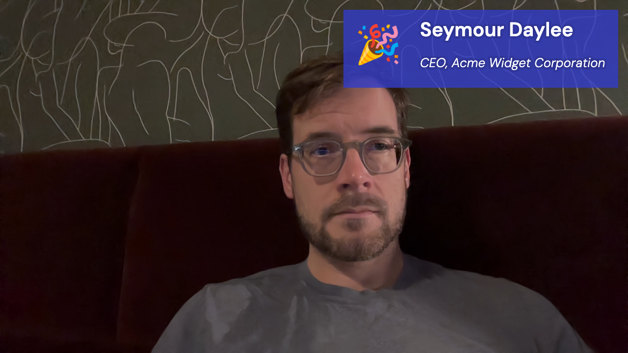
    composition_params: {
      "showBannerOverlay": true,
      "banner.title": "Seymour Daylee",
      "banner.subtitle": "CEO, Acme Widget Corporation",
      "banner.showIcon": true,
      "banner.icon.size_gu": 4.5,
      "banner.position": "top-right",
      "banner.margin_y_gu": 1,
      "banner.margin_x_gu": 1,
      "banner.title.fontSize_gu": 2,
      "banner.subtitle.fontSize_gu": 1.3,
      "banner.pad_gu": 1.3
    }
The Banner is a flexible component for many kinds of designs. It can expand in both directions to fit the text, but you have control over this behavior to ensure it stays within a designated screen area. The VCS Banner component has several params that let you decide how large it can grow horizontally.
Below, the maximum width of the component is set to 30% of the viewport size, and we're displaying some unusually long text in the subtitle:
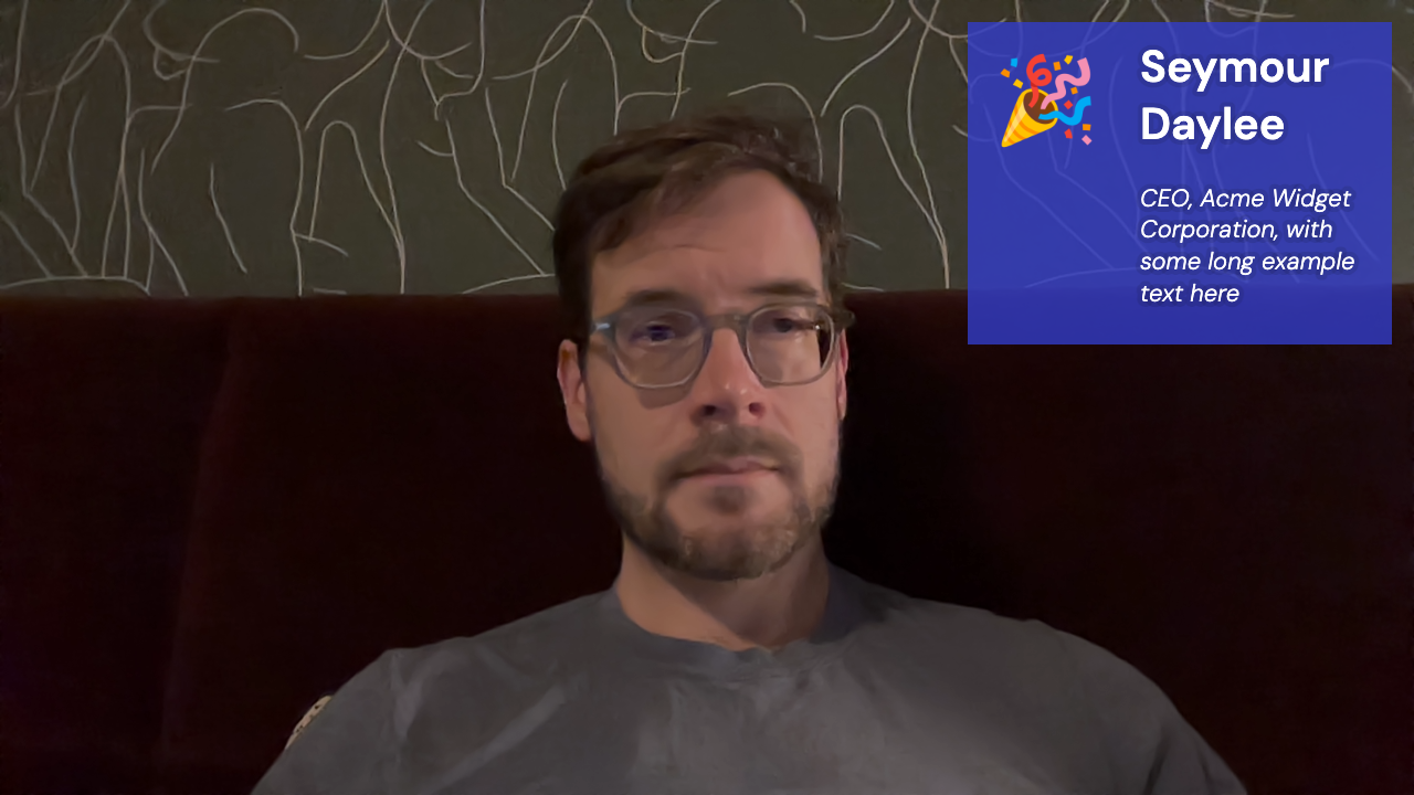
    composition_params: {
      "showBannerOverlay": true,
      "banner.title": "Seymour Daylee",
      "banner.subtitle": "CEO, Acme Widget Corporation, with some long example text here",
      "banner.showIcon": true,
      "banner.icon.size_gu": 4.5,
      "banner.position": "top-right",
      "banner.margin_y_gu": 1,
      "banner.margin_x_gu": 1,
      "banner.title.fontSize_gu": 2,
      "banner.subtitle.fontSize_gu": 1.1,
      "banner.pad_gu": 1.3,
      "banner.maxW_pct_default": 30
    }
Note how the component expands vertically to fit all the text specified for the title and subtitle. This way you don't have to worry about whether dynamic text will fit inside the Banner graphic.
Sidebar
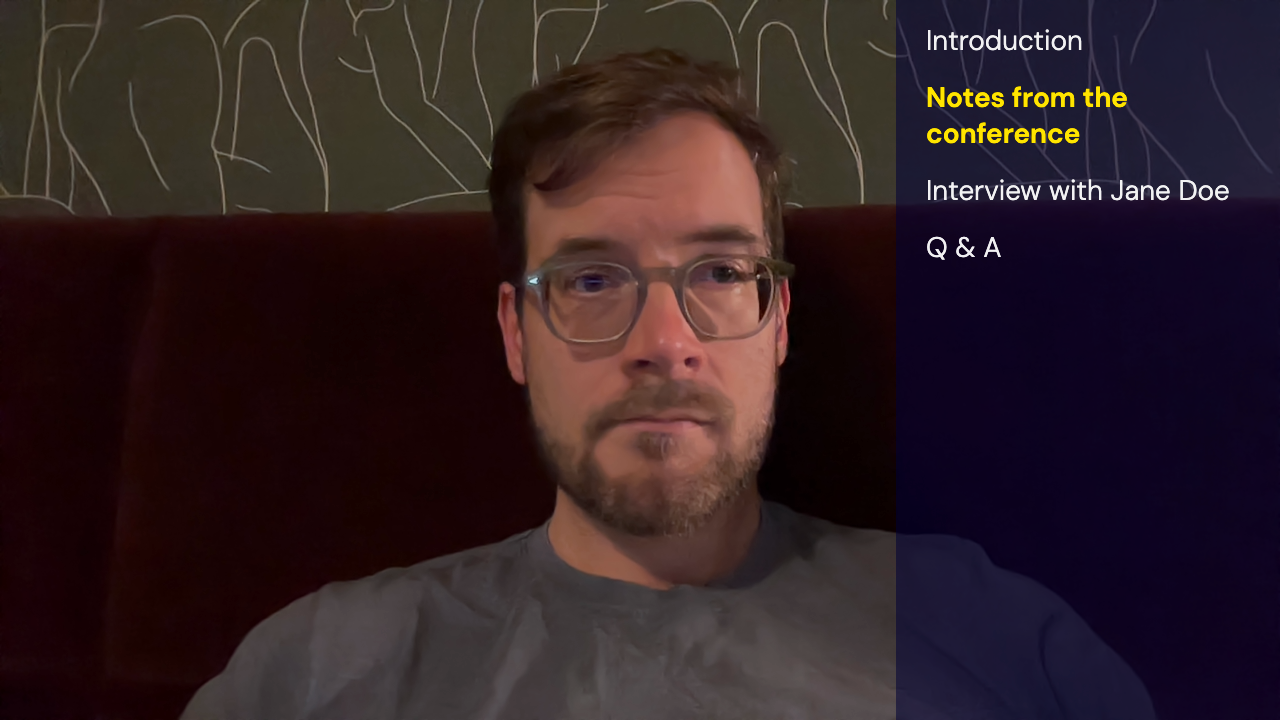
Whereas the Banner component is reminiscent of TV graphic design, the sidebar is probably familiar from desktop UI design. In its default configuration, the new Sidebar component in VCS renders as an overlay on the right-hand side of the screen:
call.startRecording({
layout: {
preset: "custom",
composition_params: {
"showSidebar": true,
}
}
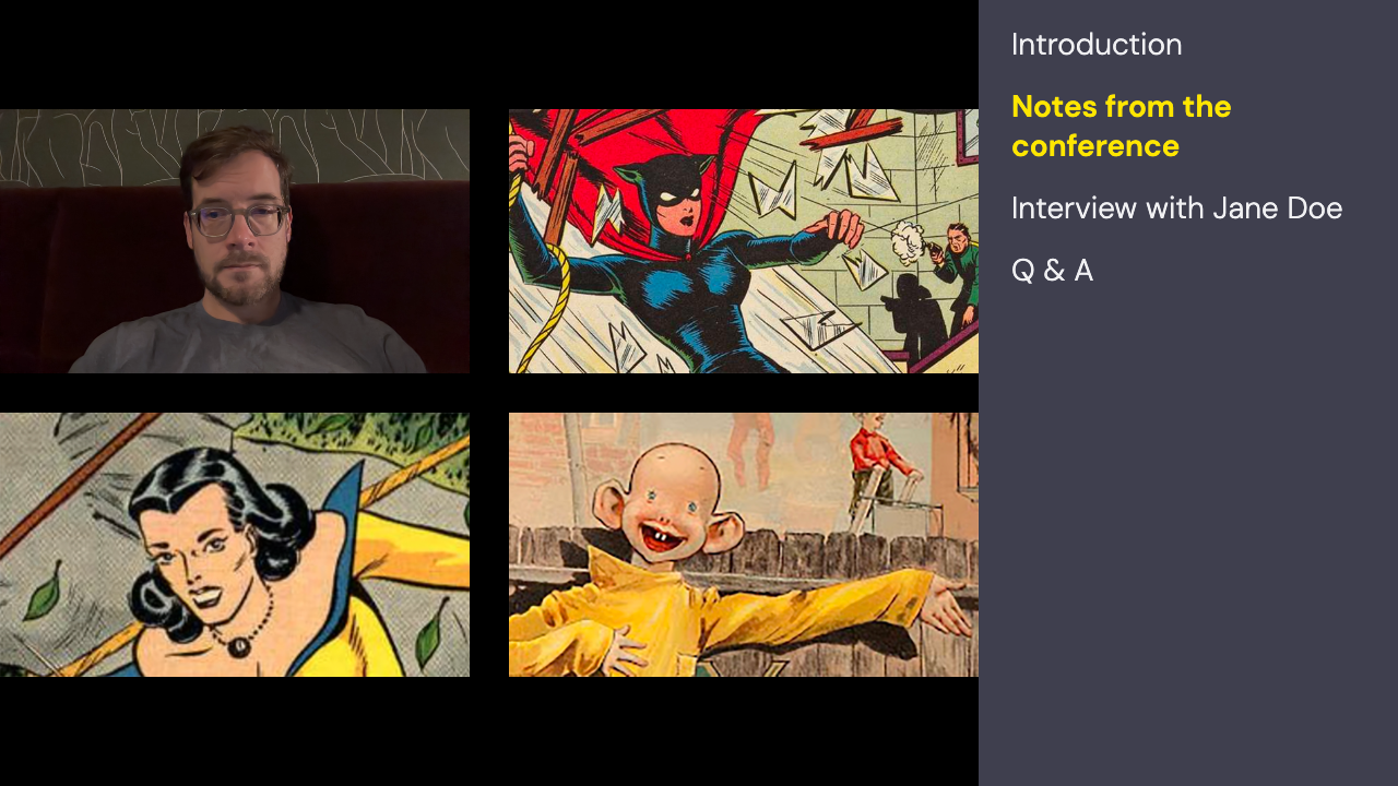
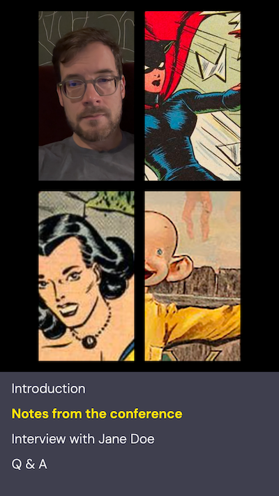
});If you don't want the sidebar to overlap the video elements, you can easily change it so that the video layout "shrinks" to make room for the sidebar. Here's a four-person video grid next to the sidebar:
    composition_params: {
      "showSidebar": true,
      "sidebar.shrinkVideoLayout": true
    }
These days it's common for live streams to be in portrait mode (and sometimes even square, for those of us who cherish compromise). The Sidebar component automatically adapts if the viewport is not landscape and moves the bar to the bottom instead. This placement is clearly better for fitting text on narrow screens:
Using params "sidebar.height_pct_portrait" and "sidebar.width_pct_landscape", you can control the sidebar's size separately for the landscape and portrait modes:
    composition_params: {
      "showSidebar": true,
      "sidebar.fontSize_gu": 1.3,
      "sidebar.height_pct_portrait": 15,
      "sidebar.width_pct_landscape": 30
    }
Here the height in portrait mode is set to only 15%, while in landscape mode we're using a width of 30%.
The sidebar component of course also has params to change its font, text color, background color, and other settings familiar from the other visual components in the VCS baseline composition.
For details on all the composition params that are available for the Sidebar component, see the startRecording reference under the heading "Group: Sidebar".
If the content within the Sidebar component is longer than would fit on screen, it automatically scrolls to the end so that the last item stays on screen. (You can see this in the last screenshot above: it's only showing three lines because all the text doesn't fit in the narrow bar when it's set to 15% height.)
This brings up an important question: how does the Sidebar component get its content? You can see in the above screenshots that the sidebar contains a list of items. There are two text styles being used --- a base style, complemented by a special highlight style applied to one selected item.
Yet there isn't a param directly in Sidebar's settings for specifying the list of items. So where does the list come from?
Highlight lines
The secret behind the Sidebar component's highlighting capability is a new feature called highlight lines. It is actually implemented as two params in the baseline composition: highlightLines.items and highlightLines.position.
The value for highlightLines.items is multiple lines of text (separated by newline characters). By updating the value for highlightLines.position you can change the highlight, as seen in the above screenshots of Sidebar where the position was set to a value of 1, thus highlighting the second item. (If you don't want the highlight, pass a value of -1. That ensures all the items will be displayed with the base color.)
You can use this data source to display any kind of list consisting of individual text items, with or without the highlight. If a line is longer than the component's display width, it will flow automatically to the next line, so text never gets truncated.
Sidebar isn't the only component that supports display of this data. You can also display it in the TextOverlay component by specifying "highlightLines.items" for the source param. The output will look like this:
    composition_params: {
      "showTextOverlay": true,
      "text.source": "highlightLines.items",
      "text.align_horizontal": "left",
      "text.align_vertical": "top",
      "text.fontSize_gu": 1.9,
      "text.offset_x_gu": 1,
      "text.offset_y_gu": 0.2
    }
Using TextOverlay rather than Sidebar gives you more freedom to place the list on-screen as it's not constrained within the sidebar. Of course it obeys the various text layout options available on TextOverlay like centering, etc.
Similarly, the Banner component has a source param that provides the ability to display items from the highlight lines source. Because space is more constrained in Banner, it opts for a different kind of rendering. Instead of showing the entire list, it shows the current item and the following one, like this:
    composition_params: {
      "showBannerOverlay": true,
      "banner.source": "highlightLines.items",
      "banner.showIcon": false,
      "banner.title.fontSize_gu": 2.1,
      "banner.subtitle.fontSize_gu": 1.4
    }
  }
});
Data sources are a powerful feature because they separate data from presentation. In an upcoming blog post, we'll see how you can drive these same visual components (Banner, TextOverlay and Sidebar) using various real time data sources too, not just the values from the highlight lines params.
Emojis as images
Previously when discussing Banner, we saw that the icon displayed inside the banner can be specified using an emoji string, like this:
    composition_params: {
      "showBannerOverlay": true,
      "banner.showIcon": true,
      "banner.icon.emoji": "🎉"
    }
The same feature is now also available for the ImageOverlay and Toast components.
For example, to render a big thumbs-up emoji as an overlay, pass it using the new image.emoji param and enable the image overlay component. Also set the aspect ratio to 1 because the emoji is a square image:
    composition_params: {
      "showImageOverlay": true,
      "image.emoji": "👍",
      "image.aspectRatio": 1
    }
The Toast component has a toast.icon.emoji param that works just like the one in Banner.
Composition backgrounds
Until now, the only option available for controlling the composition's background style was the backgroundColor property available as a configuration option when starting a recording or live stream.
That property still works, but new settings in the VCS baseline composition give you easy access to two other ways to specify a background: you can use a custom image or a WebFrame embedded browser.
Still images
With the new "image.zPosition" param, you can place an image in the background. Typically you'd want it to be full-screen, as shown here:
composition_params: {
      "showImageOverlay": true,
      "image.zPosition": "background",
      "image.fullScreen": true,
      "image.fullScreenScaleMode": "fill"
    }
Live WebFrame background
In addition to a still image, you can also use a web page as a background to your composition. This opens a lot of creative possibilities.
We introduced WebFrame back in June. It's a component that lets you embed live web content into a VCS composition, quite similar to how an <iframe> element works in HTML.
The baseline composition now has a "webFrame.zPosition" param that lets you place the WebFrame component behind all video elements. It works exactly like the "image.zPosition" param discussed in the previous section.
In combination with "webFrame.fullScreen", you can use this to render a web page that covers the entire background behind video layers.
This can be particularly useful if you have an existing web-based UI that you want to transform into a VCS-rendered stream/recording. The workflow is roughly as follows:
- In your web app, create some kind of "server rendering" display mode where you can customize which elements get displayed.
- In this mode, the app should only connect to your backend for whatever data is needed when streaming or recording. Disable all code that connects to media streams from a Daily room. Those will be rendered as VCS video layers, so the web app doesn't need to render them itself.
- In the UI, leave an empty space for the video layout.
- When starting a stream/recording, use the WebFrame composition params to load your web app in this display mode as the VCS background.
- Using composition params, adapt the VCS video layout to fit into the empty space in your UI.
For typical apps, this would get you to a place where you have the basic composition working on the server. But some tuning will most likely be needed to get the appearance you need.
More detailed instructions would be specific to how your app works. If you have animated elements that happen in the foreground (e.g., emoji reactions), you should replace them with a matching VCS component. We'd be happy to help you figure out the details of this adaptation!
At this point you might be asking: Why should video layers be separately rendered? Why not just render the entire UI in WebFrame? It's a very reasonable question! The short answer is that WebFrame doesn't support real-time rendering of video layers. It's meant for embedded documents and widgets like chat, not media playback.
The somewhat longer answer is that it's all about trade-offs. A web browser was never designed to be a server-side media engine. The VCS compositing model leverages the best technologies for each type of media, which enables us at Daily to offer this service in a scalable and affordable way.
And if you want a really long answer, you're in luck --- I've got a blog post coming soon about this topic. It will explain what "web page recording" really means in different contexts; the various solutions available in the market and why they tend to have fundamental reliability problems; and will also go into more detail on how you can structure an application to leverage VCS effectively.
What's next
In this post we saw several new ways to use graphics overlays and WebFrame. If you have questions or need help implementing these features in your app, don't hesitate to contact us for support.
The next post in the series will look at enhancements that apply to video layers, and some new ways to access room-level data. We'll see how we can use VCS for customizations like changing the design of a live video item based on whether the person has their audio muted. See you soon on this blog!
Never miss a story
Get the latest direct to your inbox.