


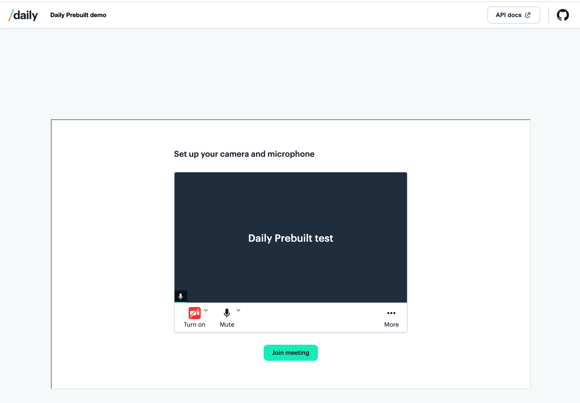
Daily Prebuilt offers a quick plug-and-play option for adding video chat to your app with just a few lines of code. Daily Prebuilt offers many default settings to get started, but it’s common to want to update the defaults to meet your app’s specific requirements.
One example where we often see customization is related to how the Daily Prebuilt fits into the app’s layout; sometimes it needs to fill the whole screen, while in other cases it should always be the same size. It may also need to update its size as a window is resized or to accommodate various device sizes to make the video experience feel more responsive.
This last example, resizing the Daily Prebuilt’s dimensions on window resize, can feel a little tricky if you aren’t super comfortable with CSS. (Spoiler alert: you don’t have to be!)
In today’s tutorial, we’ll look at two ways to manage setting Daily Prebuilt iframe’s dimensions on window resize while maintaining a constant aspect ratio. This will ensure the Daily Prebuilt iframe responsively fills the available space in your app while maintaining an aspect ratio that meets your app’s requirements.
We'll go through a few examples on how to customize the video sizes in your layout by:
- Using pure CSS to set the
aspect-ratioproperty - Using plain JavasScript to set a
resizeevent handler - Rewriting the plain JavaScript solution with a React
useEffecthook
Understanding the UI issues we’re trying to solve
By default, the Daily Prebuilt iframe that gets embedded into your app will fill the space available in the parent element. Another way of saying that “in CSS” is that the width and height properties have a value of 100%.
For the most part, this is a good default to set; you probably want the video to fill the available space. One situation where it may become an issue is if the parent container changes size often or if it is not actually the dimensions you want the video call to be.
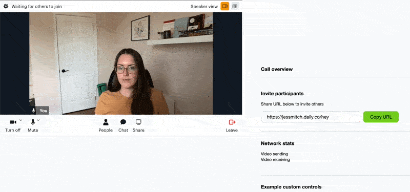
In the example below, the video fills the parent container, which has a height that is larger than the width. In some cases, this may be exactly what you want. However, you might find the black bars above and below the video may take up more space than is ideal or maybe you don’t want to show them at all.
Another example of when the iframe’s dimensions may cause issues on window resize or on different devices is if you set the dimensions using absolute units (e.g. pixels).
Note: “Absolute units” refer to units that are rendered the same size regardless of the window or parent element’s size. This is in contrast to “relative units” (e.g. percentage) which will have a rendered size relative (or dependent) on the parent element’s size.
Let’s say you create the Daily iframe like so:
const callWrapper = document.getElementById('wrapper');

callFrame = await window.DailyIframe.createFrame(callWrapper, {
   iframeStyle: { height: '450px', width: '800px' },
});
Because absolute units are used here, the iframe will always be 800px by 450px unless we somehow intervene. This solution is not ideal for modern websites because it’s not responsive. If we opened this on a phone in portrait mode, the right side of the video would get cut off.
What is an aspect ratio?
Before we dive in, let’s clarify what the phrase “aspect ratio” means. Generally speaking, the aspect ratio refers to the ratio of the width of an element/display (e.g. screen, video, image) compared to the height.
For example, if a video is 1600px wide and 900px in height, we can say the aspect ratio is 16:9. (16:9 is the same as saying 1600:900 but reduced to its simplest terms.)
Videos are often displayed in standard aspect ratios, such as 16:9, 4:3, or 16:10. Those ratios are sometimes inverted on mobile devices when in portrait mode (e.g. 10:16).
If we had a video with a width of 100px and we wanted to figure out what height it would have with a 16:9 aspect ratio, we’d just have to do a little math:
const height = 100 / (16 / 9); // 56.25
Getting started
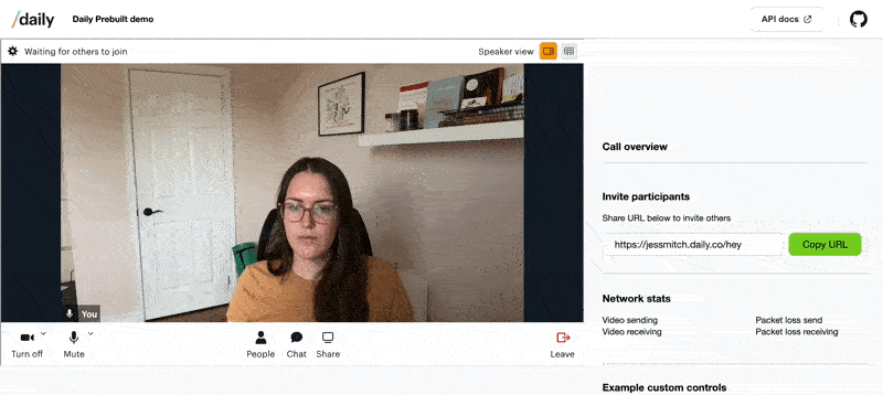
To test out different examples of updating the Daily Prebuilt aspect ratio on window resize, we can use the Daily Prebuilt demo. Be sure to clone a local copy of the aspect-ratio-demo branch specifically to access the solutions provided below.
Once you’ve cloned the repo, navigate to the root directory of the repo and run the following commands:
npm install
npm run dev
Solution 1: Good ol’ CSS
Recently, a CSS property called aspect-ratio came out that has reduced the amount of math you have to do for setting aspect ratios on elements.
Looking at the index.css file in the Daily Prebuilt demo, we can uncomment line 160:
.in-call iframe {
 /* ASPECT RATIO STYLING OPTION 1*/
 aspect-ratio: 16/9; // <- line 160
 display: block;
}
In index.js, notice the custom iframe styles being passed in the createFrame method:
 const callWrapper = document.getElementById('wrapper');

 callFrame = await window.DailyIframe.createFrame(callWrapper, {
   iframeStyle: { height: 'auto', width: '100%' },
 });
height is set to auto and width uses Daily's default value, 100%.
This means the width will always fill the parent container and the height will adjust. These custom settings and the aspect-ratio setting applied together mean the width will be 100% and the height will be whatever maintains the 16/9 aspect ratio specified in the CSS block.
This makes for a great solution but, as is the case with any new CSS properties, it’s good to be aware of browser support. aspect-ratio is widely supported by various browsers but not by some like Internet Explorer or iOS Safari (at the time of writing this).
Solution 2: Using JavaScript to set a resize event listener
If you’re more comfortable with JavaScript, you may prefer to use an event listener to handle setting the height property of the iframe.
To do that, we can return to the index.js file and uncomment the code for “OPTION 2”.
Note: Remember to comment out the CSS code from Option 1 above to test Option 2.
/* ASPECT RATIO STYLING OPTION 2*/
const updateSize = () => {
 const iframe = document?.getElementsByTagName('iframe')?.[0];
 if (!iframe) return;

 const width = iframe.getBoundingClientRect().width;
 const height = width * (16 / 9);
 iframe.style.height = height;
};

window.addEventListener('resize', updateSize);
/* [END] ASPECT RATIO STYLING OPTION 2*/
In this block, we’re doing a few things:
- We select the iframe element from the DOM and get its rendered width with
getBoundingClientRect().width. - We calculate the height using the width and the aspect ratio of our choice. In this case we’re using 16:9.
- We set the iframe’s
heightstyle property directly with the height value we calculated above. - Lastly, we add an event listener that calls
updateSizewhenever the window gets resized.
This will achieve the same outcome as the example above, but purely with JavaScript. So far, though, the height only gets set on resize— not on load— which means the height is still set to auto until it is resized.
To ensure we are setting the height on load, let’s call updateSize as soon as the call is joined. It will set the calculated height when the call first loads and then also update the height via the event listener as the window gets resized afterwards.
There are two places to do this and which gets called will depend on your room configuration settings.
If you are using Daily Prebuilt’s prejoin UI, you will need to call updateSize when the prejoin UI (or “lobby”) is displayed:
function toggleLobby() {
 const callWrapper = document.getElementById('wrapper');
 callWrapper.classList.toggle('in-lobby');

 /* ASPECT RATIO STYLING OPTION 2*/
 updateSize();

 toggleHomeScreen();
}
If you are not using the prejoin UI, you can add updateSize to joinCall, which will get when the call is first initialized.
async function joinCall() {
 ...

 try {
   await callFrame.join({
     url: url,
     showLeaveButton: true,
   });

   /* ASPECT RATIO STYLING OPTION 2*/
   updateSize();
...Calling updateSize in these two spots, in addition to the resize event handler, means the video call will always be the right dimensions, regardless of your room's settings.
What about React?
If you’re like us at Daily, you’re probably writing a lot of React and not a lot of plain JavaScript. If that’s the case and you prefer your JavaScript solutions in React, we’ve got you covered.
The React equivalent for the JavaScript solution above looks like this, which is pulled from our webinar demo:
const videoRef = useRef(null);
 const [height, setHeight] = useState(400);

useEffect(() => {
   let timeout;

   // handles setting the iframe's height on window resize to maintain aspect ratio
   const updateSize = () => {
     if (!videoRef?.current) return;

     clearTimeout(timeout);

     timeout = setTimeout(() => {
       setHeight((videoRef?.current?.clientWidth) / (16 / 9);
     }, 100);
   };

   updateSize();

   window.addEventListener("resize", updateSize);
   return () => window.removeEventListener("resize", updateSize);
 }, [videoRef]);

...

return (
...
<VideoContainer height={height} hidden={currentView !== "call"}>
  <CallFrame ref={videoRef} hidden={currentView !== "call"} />
 </VideoContainer>

)
In this example, we add a React ref to the CallFrame component, which is where the iframe gets rendered. Next, we use a useEffect hook to, once again, set an event listener that selects our target element, gets the width, and then sets the height after calculating it on window resize.
Throttling resize events
In the React solution above, you may have noticed that we have a timeout included to throttle the number of times we call setHeight on window resize. This is to avoid setHeight being called way too many times for the same resize motion.
This same idea can be applied to the plain JavaScript solution above if you’re noticing any performance issues that may result from the resize event getting called multiple times from one resize motion.
Wrapping up
As is often the case when asking which solution is best: "It depends". Which browsers you need to support will factor into your choice and you may be more comfortable working with one over the other (CSS vs JavaScript). We tend to let CSS do the heavy lifting when possible but ultimately it’s up to you.
To learn more about Daily Prebuilt, check out its features and use cases, as well as this previous tutorial on building a webinar with Daily Prebuilt.
Never miss a story
Get the latest direct to your inbox.